Hi, I'm Ayomide Jubril, an AI Product Designer crafting
intuitive experiences that convert users and scale business.
Over 3 years of turning complexity into results.
Mobile App · UX Design
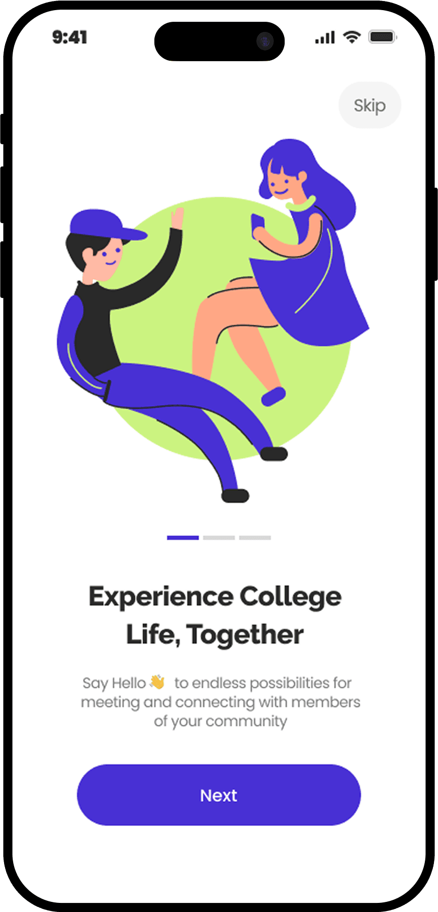
Count Me In App
A social App designed for International Students
Open project
UX Strategy · Research
Rewiring X (Twitter)
UX strategies to mitigate misinformation spread
Open project
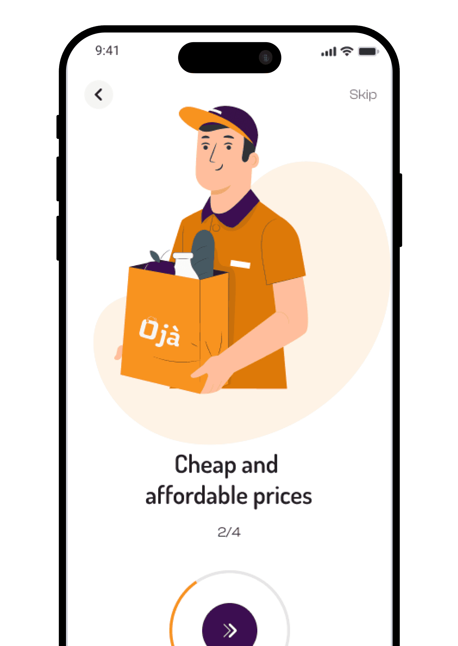
E-Commerce · Product Design
OjaNow App
E-commerce platform delivering essentials in Lagos, Nigeria
Open project
Web Redesign · Usability
CollegeScholarship Redesign
Improving the existing collegescholarships.org website
Open project
Visual Campaign
Visual Design · Research
Police Brutality Campaign
A research-led visual campaign to end police brutality in Nigeria
Open project
Mobile App · UX Research & Design · 2023
Count Me In App
A social platform built to help international students discover events, find guides, ask
questions, and build real connections all in one trusted space.
Role
Product Strategy & UI Design
Team
3 designers
Tools
Figma · Maze · Notion
Overview
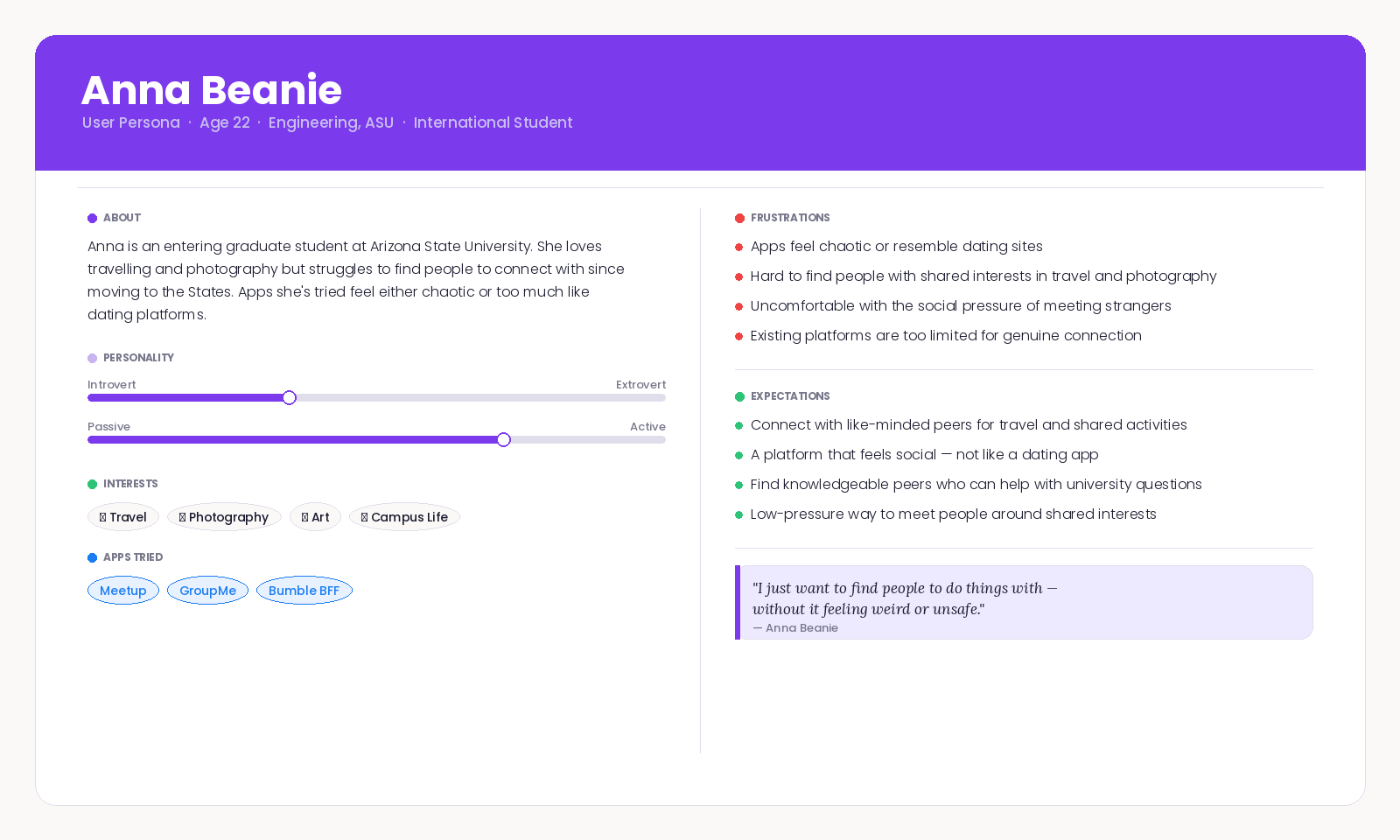
The loneliness problem no app had solved for international students
International students consistently face an invisible wall when adjusting to a new
campus. Transportation fades as a challenge over time, but social isolation doesn't. No existing platform
combined trusted event discovery, peer assistance, and community discussion in a way designed specifically for
this group.
We set out to build something that felt safe, motivating, and genuinely useful from day
one on campus.
Research
20 students. One consistent pain point.
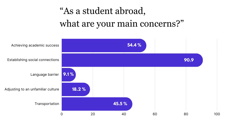
We ran surveys with 11 students and in-depth interviews with 9, focusing on two primary
problem areas: socialization and transportation. The data quickly told us where to focus.
90.9%
cited establishing social connections as their top challenge
54.4%
were balancing academic pressure alongside adjustment stress
45.5%
flagged transportation as an early, but temporary, pain point
Students struggled most to connect outside their immediate cultural group, as language barriers made casual
socialising feel risky.
Existing apps lacked trust signals. Random meetups felt unsafe, and no platform was built specifically for
this audience.
Motivation to keep using a social app dropped sharply without a reward loop or reason to return daily.
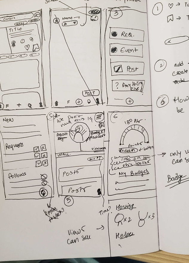
Design Decisions
Four features, each solving a specific research finding
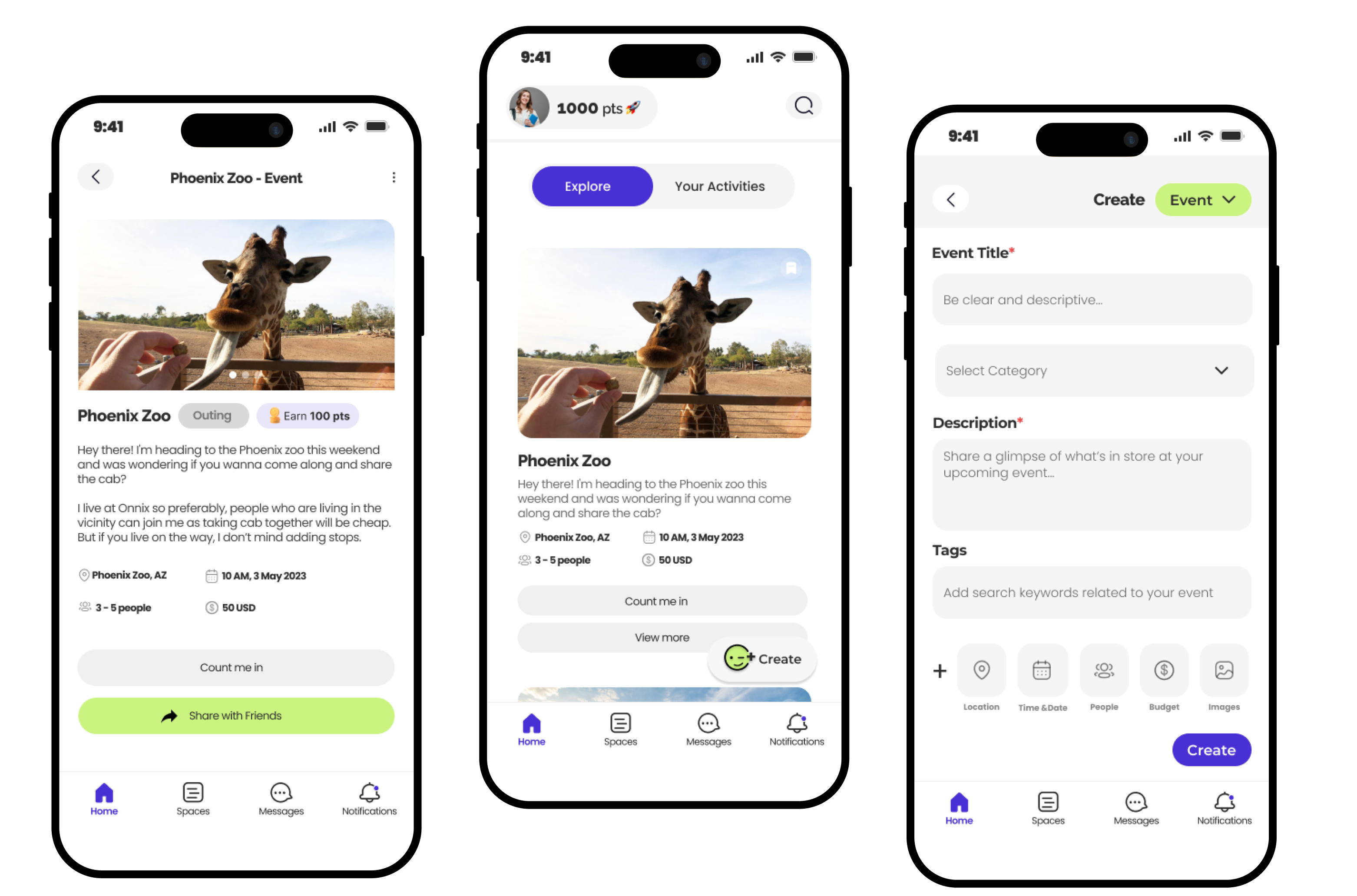
Host & Join Events
Students can discover and host verified events, which addresses the trust problem that
made random meetups feel unsafe.
Guide & Request
Anyone can post a campus assistance request or offer to be a guide, creating mutual
support loops between students.
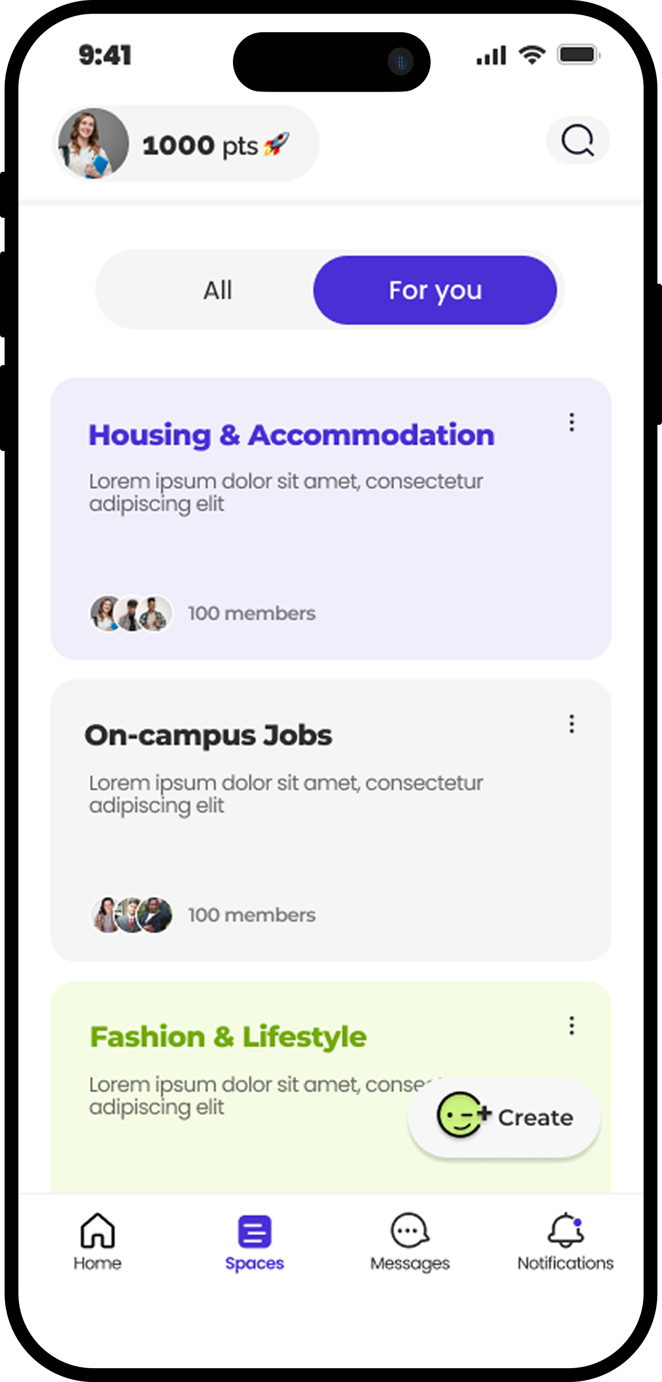
Spaces
Topic-based forums let students ask questions and find people with shared interests
without the awkwardness of cold introductions.
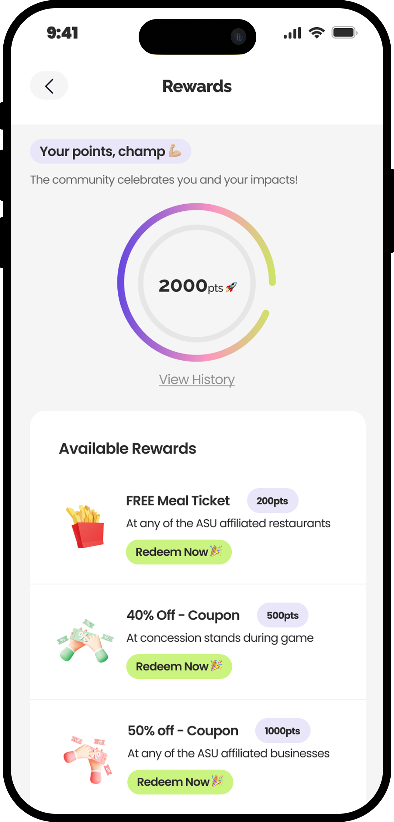
Rewards & Badges
Points earned through participation are redeemable for local perks, driving the
sustained daily engagement other apps lacked.
High-Fidelity Designs
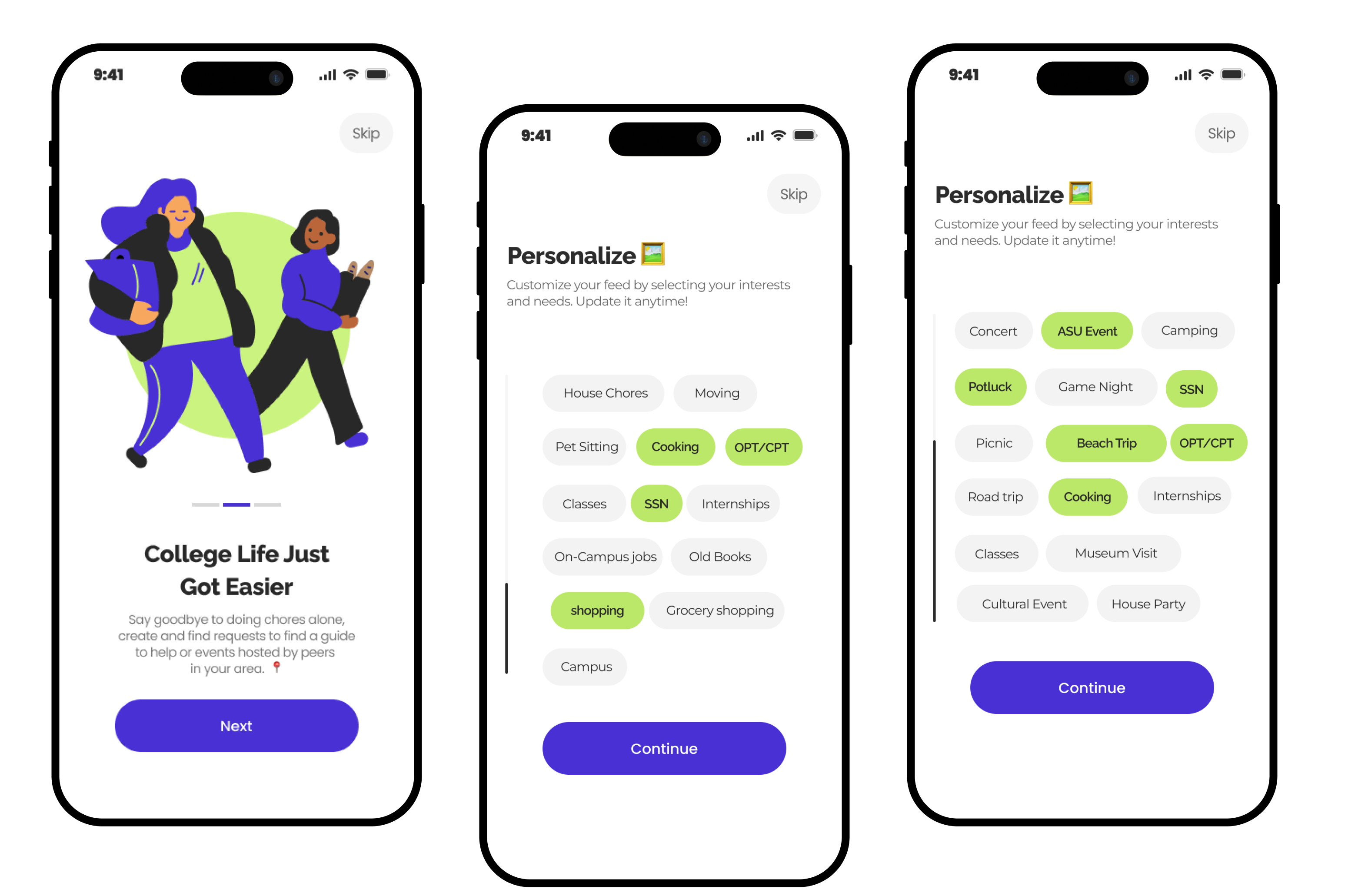
Onboarding & personalised feeds
The onboarding flow collects interest signals upfront to personalise the event feed
immediately, removing the empty-state problem that causes drop-off in social apps.
Host & join events
Event cards surface key details at a glance: date, location, and who else is going —
verification badges signal trust without extra friction.
Spaces & rewards
Topic-based spaces organised by category, and a rewards dashboard that makes progress
visible, both designed to keep students coming back.
Usability Testing
Testing confirmed the core concept and surfaced real fixes
Three participants each completed five tasks: creating a profile, hosting an event,
browsing Spaces, exploring their profile, and redeeming a reward. Sessions ran 45 minutes each.
The rewards and events features were the most positively received, as users called them intuitive and
motivating.
"Spaces" needed a clearer label; the term confused participants unfamiliar with the concept.
The "Count on me" button wording caused confusion and was flagged for a language revision.
The prototype achieved strong usability scores and was recognised by stakeholders as a
viable product ready for further development. Participants wanted to keep using it after the session ended.
84.2
Avg SUS Score
100%
Task Completion
67
Net Promoter Score
Deliverables
User SurveysUser InterviewsCompetitive AnalysisPersonaBrand DirectionLow-Fidelity WireframesHigh-Fidelity DesignsUsability Testing
Next Project
Rewiring X (Twitter)
Web Redesign · Research & UX Design · 2023
CollegeScholarship Redesign
Transforming a cluttered financial aid website into a clear, fast, and trustworthy
resource for the millions of students who need it most.
Role
Solo Designer & Researcher
Methods
Heuristic Analysis · Usability Testing
Tools
Figma · Maze · FigJam
Overview
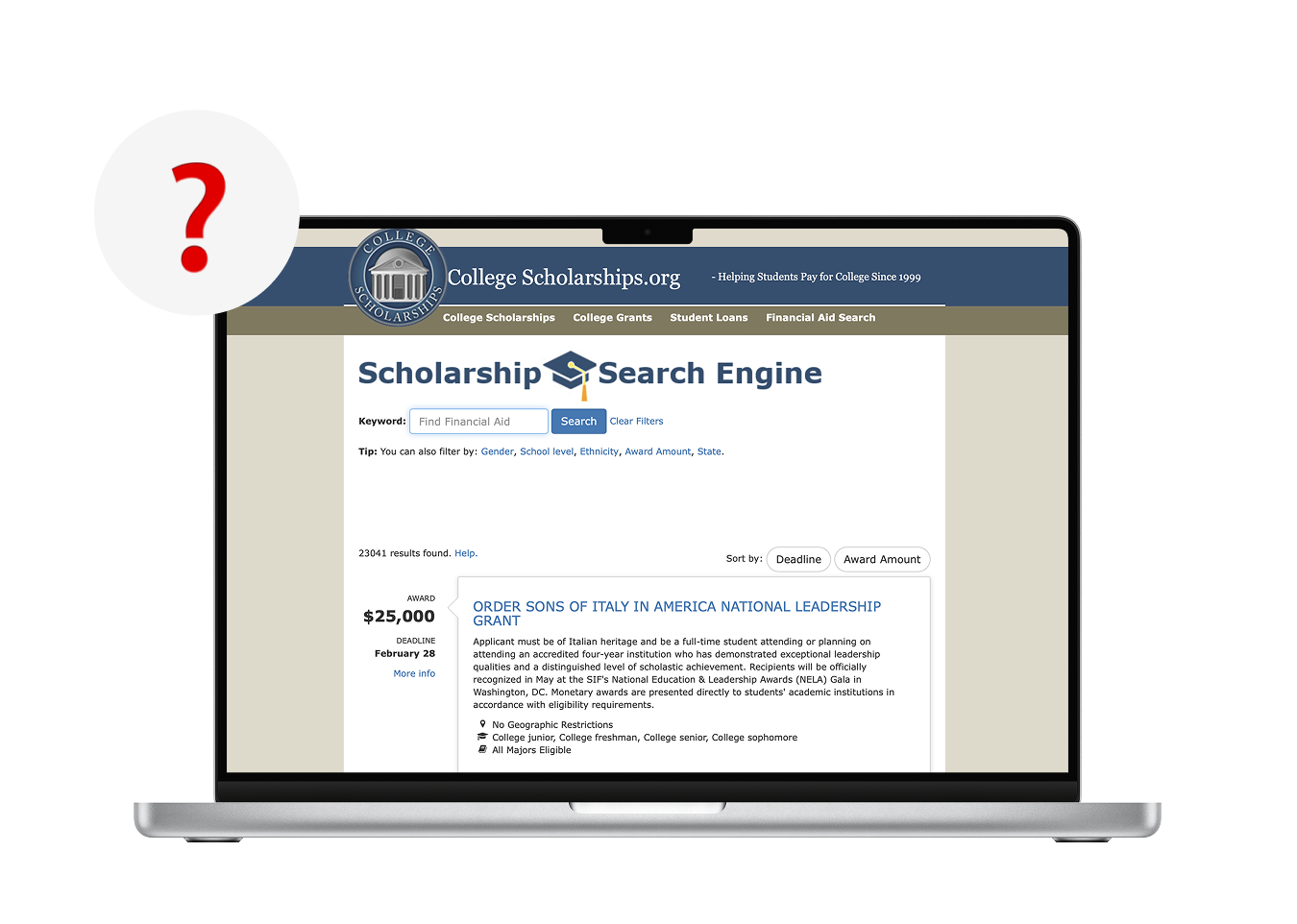
A website that frustrated the very students it existed to help
Collegescholarships.org serves millions of students seeking financial aid, but its
cluttered interface, poor information hierarchy, and absent navigation made the core job nearly impossible.
Content overwhelmed rather than guided. Important actions had no visual emphasis. Users gave up before finding
what they came for.
I led this redesign from heuristic analysis through to high-fidelity, guided by
a single principle driving every decision: simplicity in service of the user's actual goal.
Every single participant struggled before I changed a pixel
I ran moderated usability testing with 5 participants across three user groups — remote and in-person — before designing anything. 8 tasks were tested covering navigation, search, eligibility checks, and application. Every design decision that followed was grounded in what I observed, not assumption.
87.5%
overall task success rate on the existing site — with Search & Filter at just 60%
88s
average time to complete a search and filter task — the site's most critical journey
5
critical usability issues logged, with navigation scoring the highest severity across all participants
Navigation was the highest-severity issue (score 60). Every participant struggled to find relevant information — the top nav was described as unhelpful, and there was no way to recover when users got lost.
Search and filter was the lowest-performing task with only a 60% success rate. Participants ran into errors they couldn't recover from without assistance.
Content volume was overwhelming across all 5 participants. Think-aloud sessions captured this directly: "I don't wanna go through these 300 pages" and "This information is too much to process."
100% of participants were first-time users and 100% left dissatisfied — yet 80% said they would still recommend the site to a friend, confirming the need was real even if the experience wasn't.
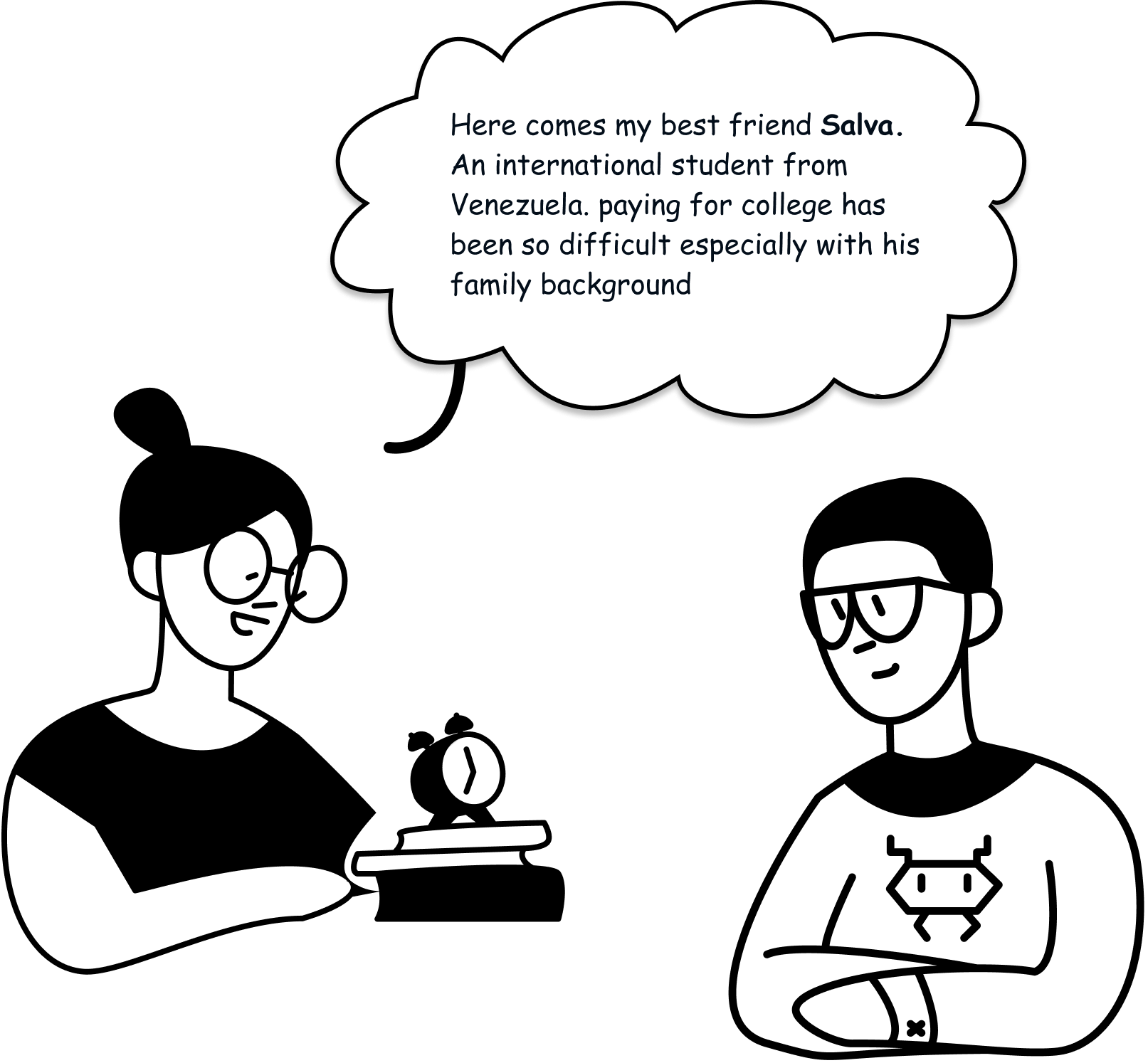
User Groups
Three distinct users all underserved by the same broken experience
International Students
Actively seeking funding, frequently blocked by eligibility walls. Need clear
filtering and results tailored to their status.
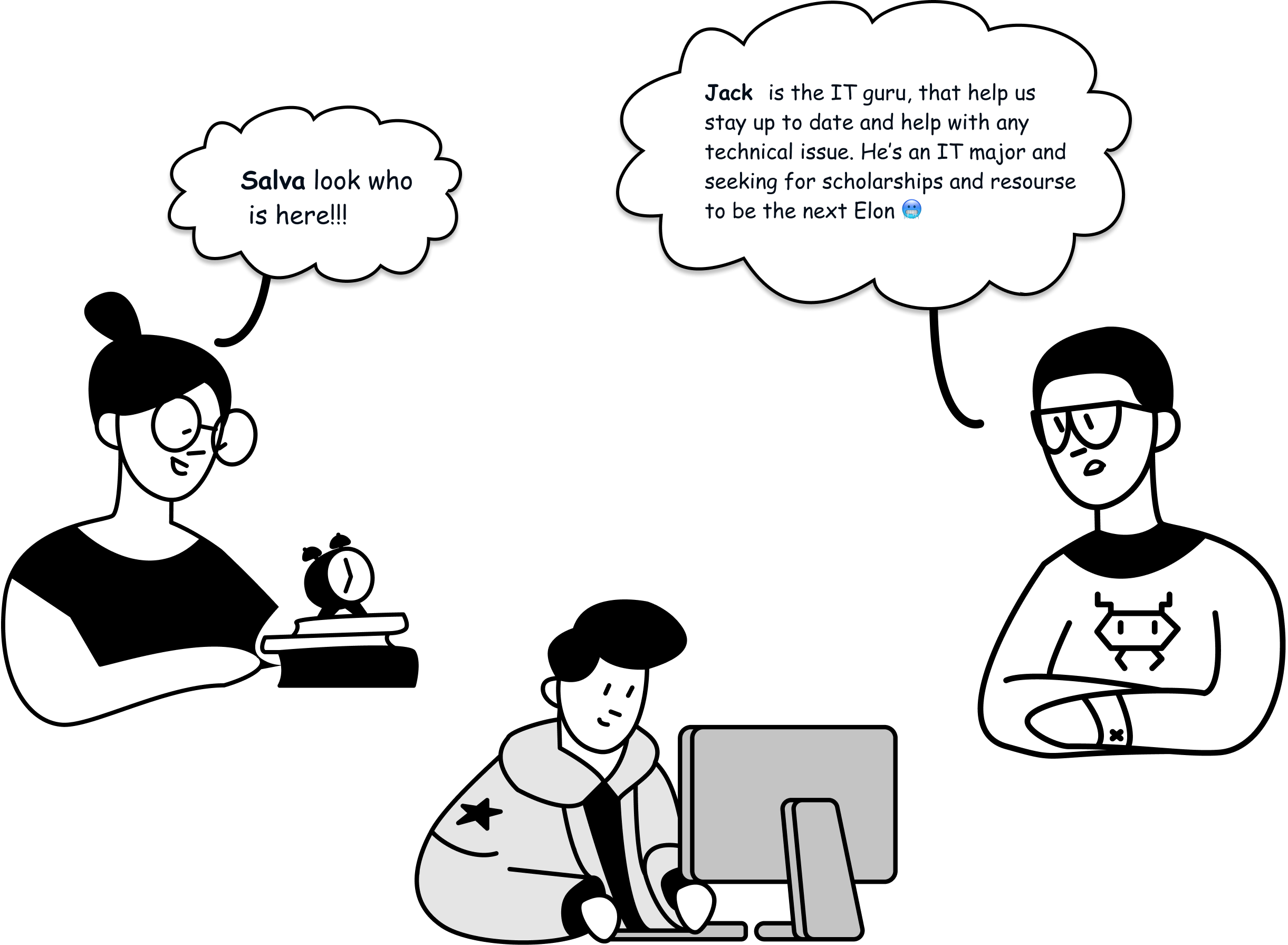
Graduate Researchers
Time-poor and goal-driven. Need to surface relevant grants quickly without wading
through unrelated content.
Domestic Students
Unfamiliar with the financial aid process. Need clear guidance and a low-friction
path from discovery to application.
Design Principle
Simplicity, consistency, and trust: every page prioritises white space, clear
hierarchy, and the user's next step.
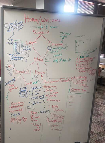
Low-Fidelity Wireframes
Restructuring the information architecture first
Before any visual design, I mapped a new IA that guided users directly to their goal —
scholarships, grants, or loans without nested navigation or dead ends.
High-Fidelity Designs
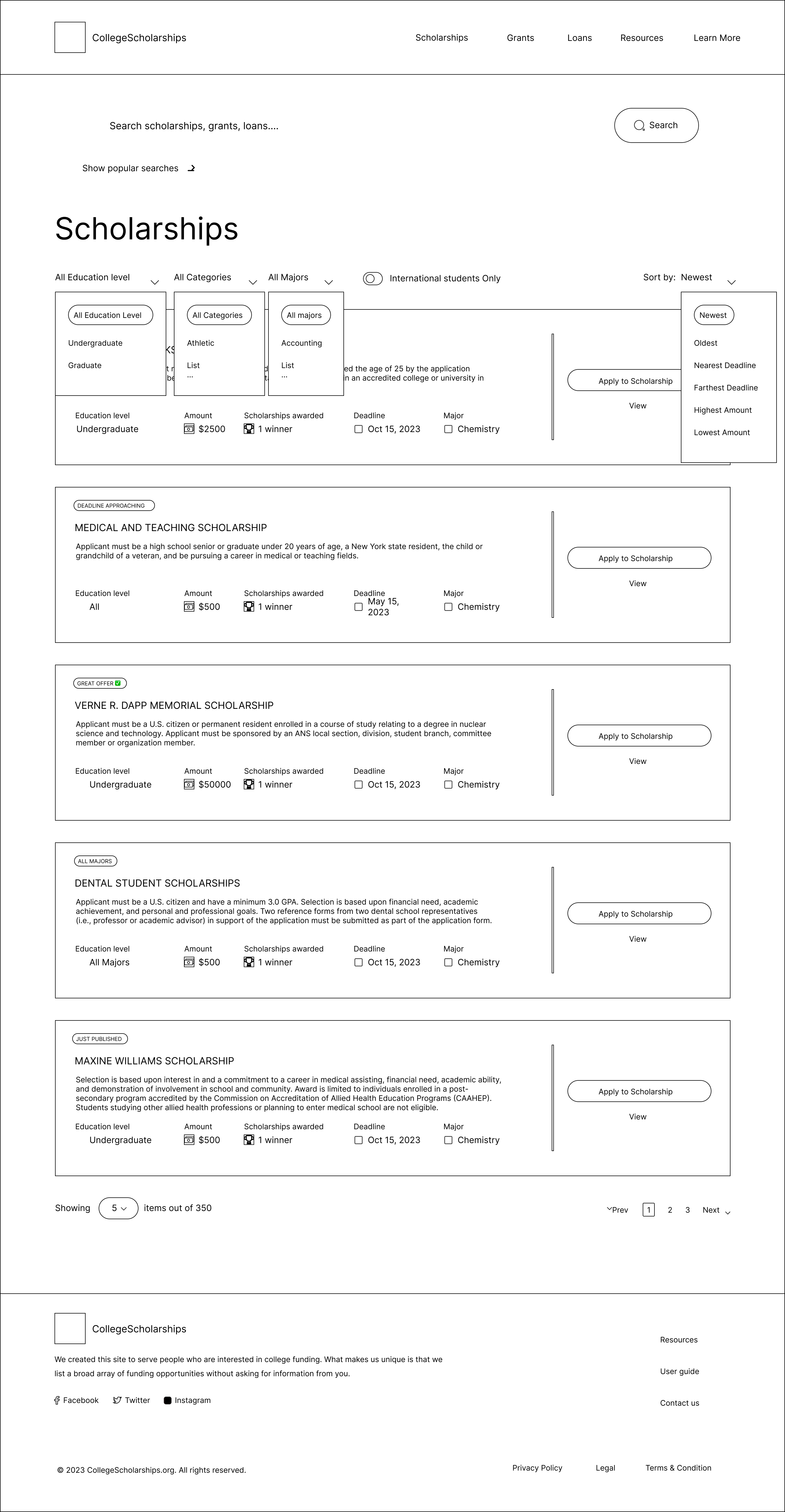
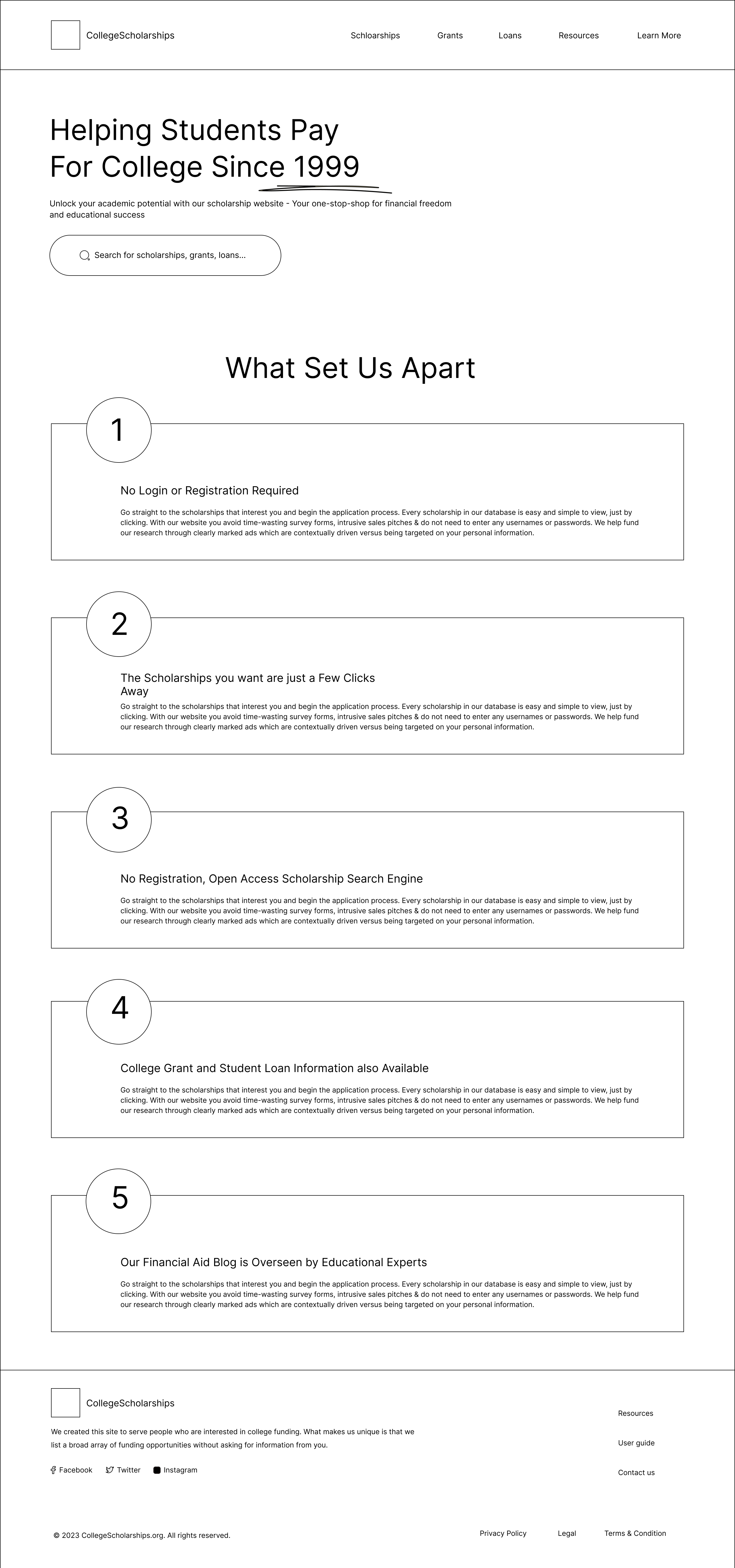
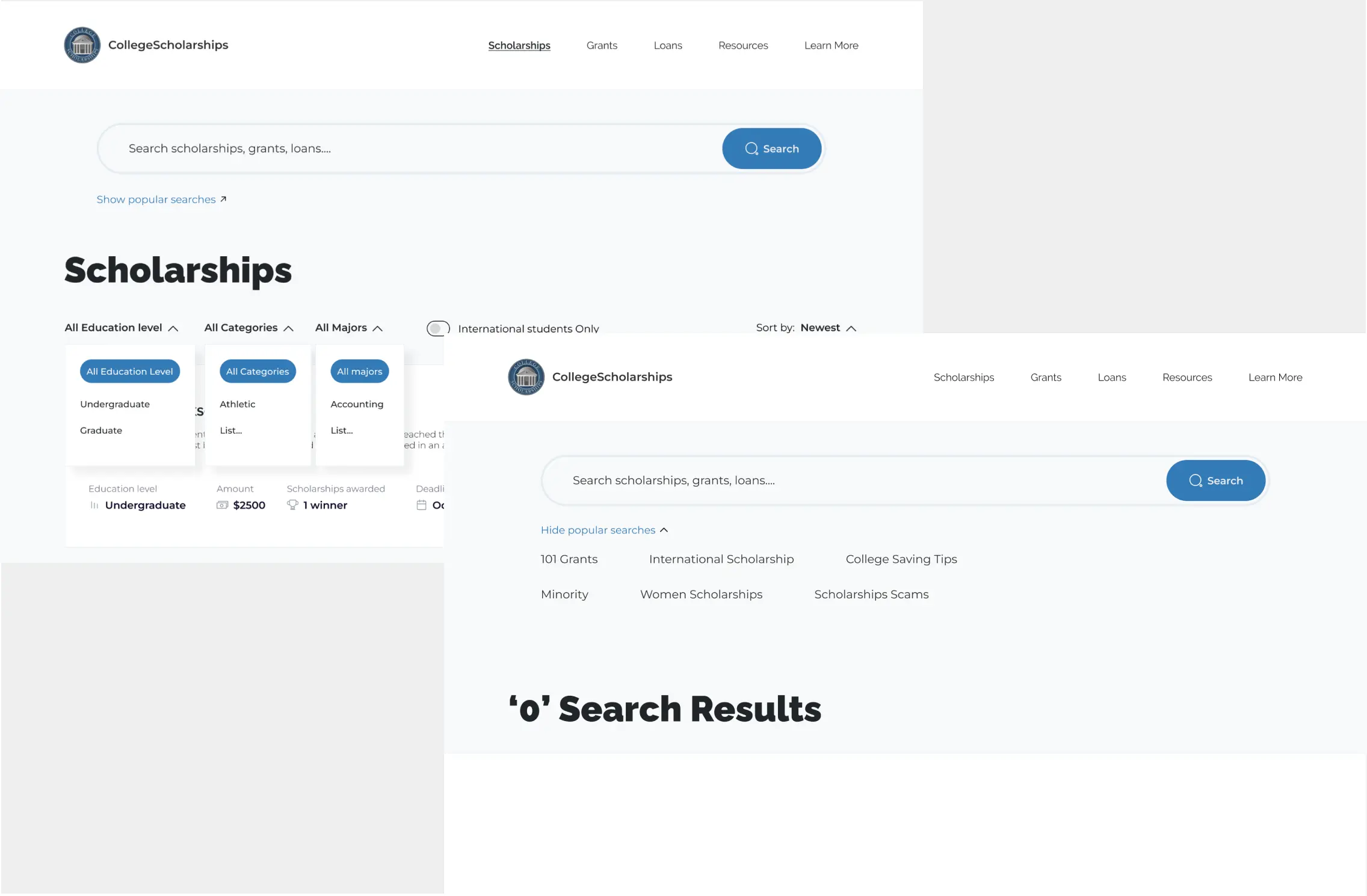
Before → After: Navigation
The original site was an unending nest of information with no structure. I reorganised
major sections to create a direct path to scholarships, loans, and grants, with a resource hub that was
always one click away.
Before
After
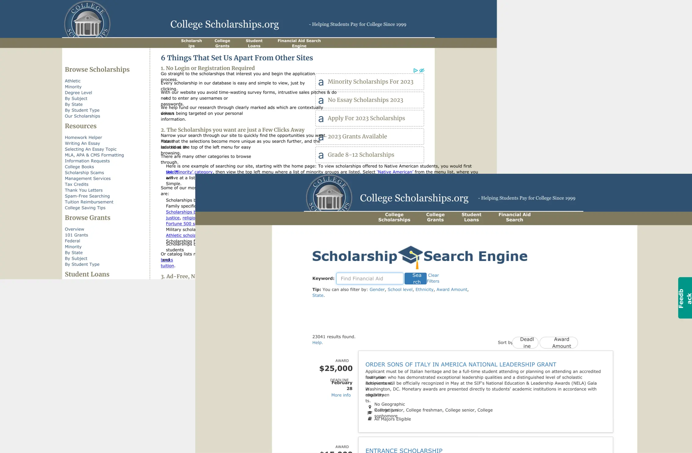
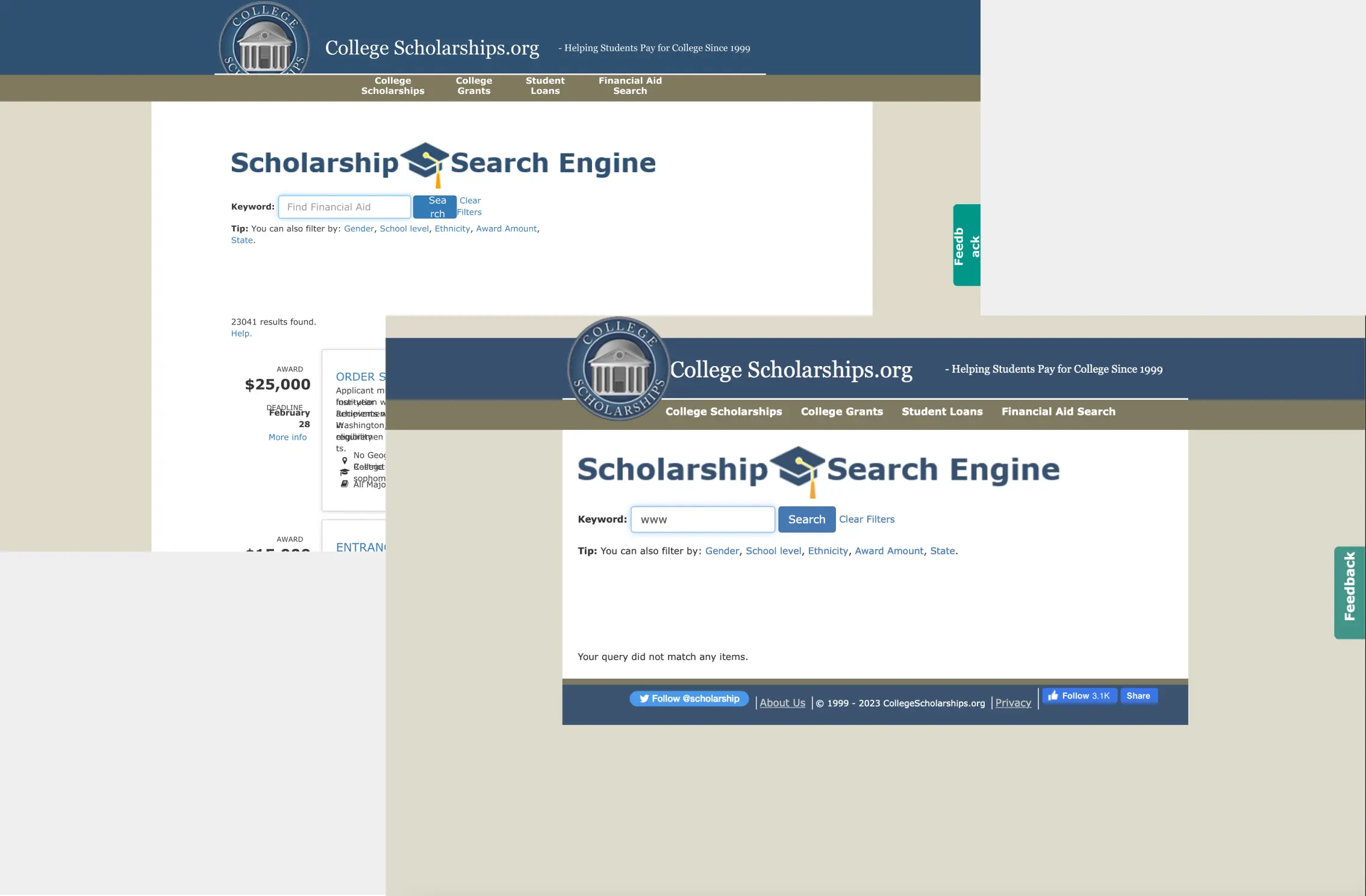
Before → After: Search & filtering
The original search returned an unending scroll with no way to narrow results. I
introduced intuitive sort and filter controls, popular search suggestions, and paginated results with clear
user control at every step.
Before
After
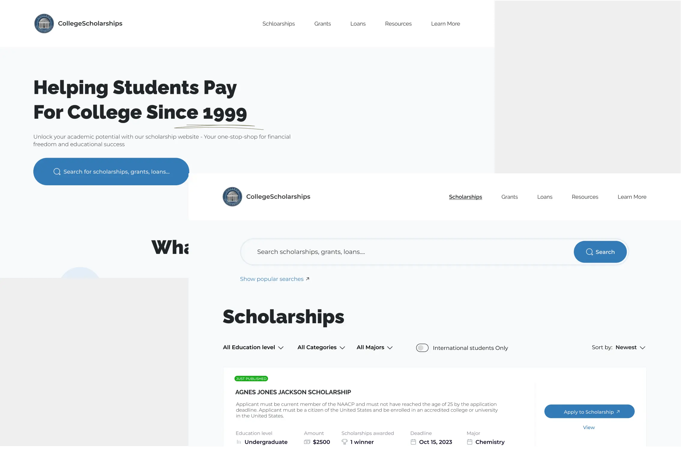
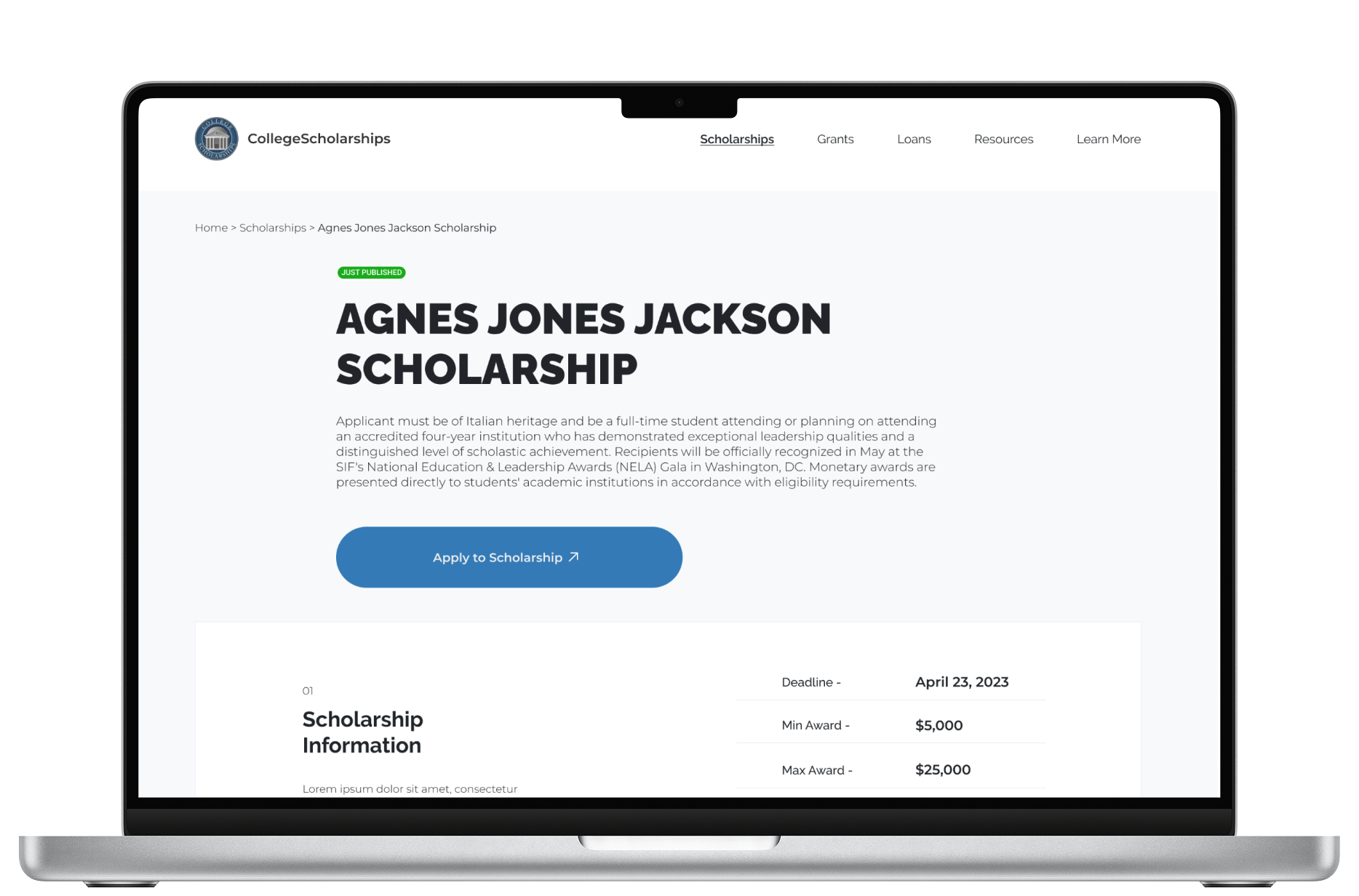
Scholarship detail page
Each listing now surfaces eligibility criteria, deadline, award amount, and application
information in a structured layout so students can qualify themselves at a glance before investing time in
an application.
Outcomes
Result
Each design decision mapped directly to a logged usability issue. The navigation overhaul addressed the highest-severity finding (score 60). The multi-filter system solved the 60% Search & Filter failure rate. The structured scholarship detail page tackled the eligibility comprehension problem. The redesign was presented to industry professionals and described as a substantial improvement that finally put the user's actual goal at the centre of the experience.
An e-commerce platform delivering groceries and essential items to customers' doorsteps
in minutes, designed for both customers and riders, end to end.
Role
Product Designer · Design Lead
Duration
12 Weeks
Tools
Figma
Overview
Essentials delivery on demand, even at odd hours
OjaNow was founded by three Nigerian entrepreneurs who identified a clear gap in the
market: no reliable, prompt service existed for delivering groceries and daily essentials when people actually
needed them. The platform stocks over 300 products across strategic locations to keep delivery times within
minutes, not hours. Designing for the Nigerian context added a specific layer of complexity — inconsistent street addressing and the near-absence of reliable mapping data make rider-to-customer navigation a real operational challenge, not just a UX one.
I led design across the entire mobile experience: the customer app and the rider app,
while overseeing the design direction for the web and admin interfaces.
The Challenge
Building for conversion and retention from day one
The core business challenge wasn't just building an app but building one that
converted visitors into buyers and kept them coming back. I joined after the initial stakeholder alignment and
market research, reviewed the product documentation and existing findings, then collaborated with the product
manager and technical lead to define the design strategy.
Conversion rate and retention were the two metrics the business cared about most. I kept
both front of mind through every design decision, from the browse experience to the checkout flow to the
rider handoff.
Business Goals
Targets set before launch
2–3%
minimum conversion rate target
₦1k–5k
target average order value per transaction
2
apps designed — customer-facing and rider-facing
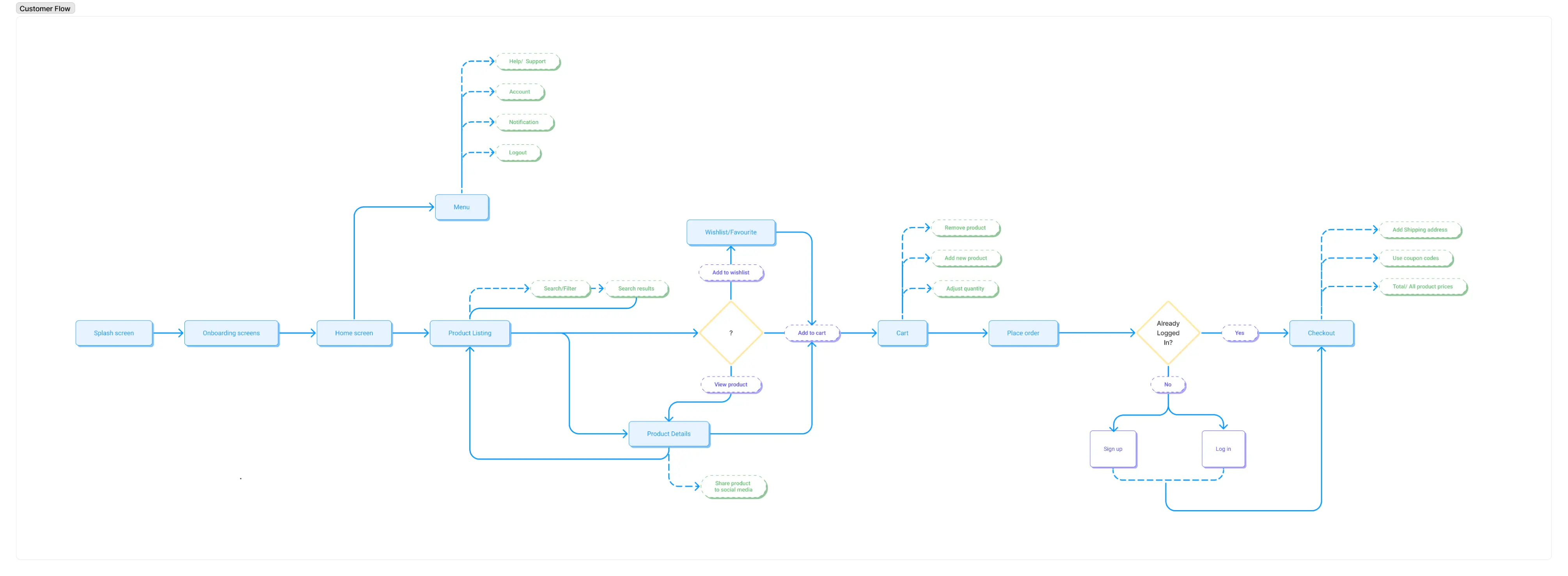
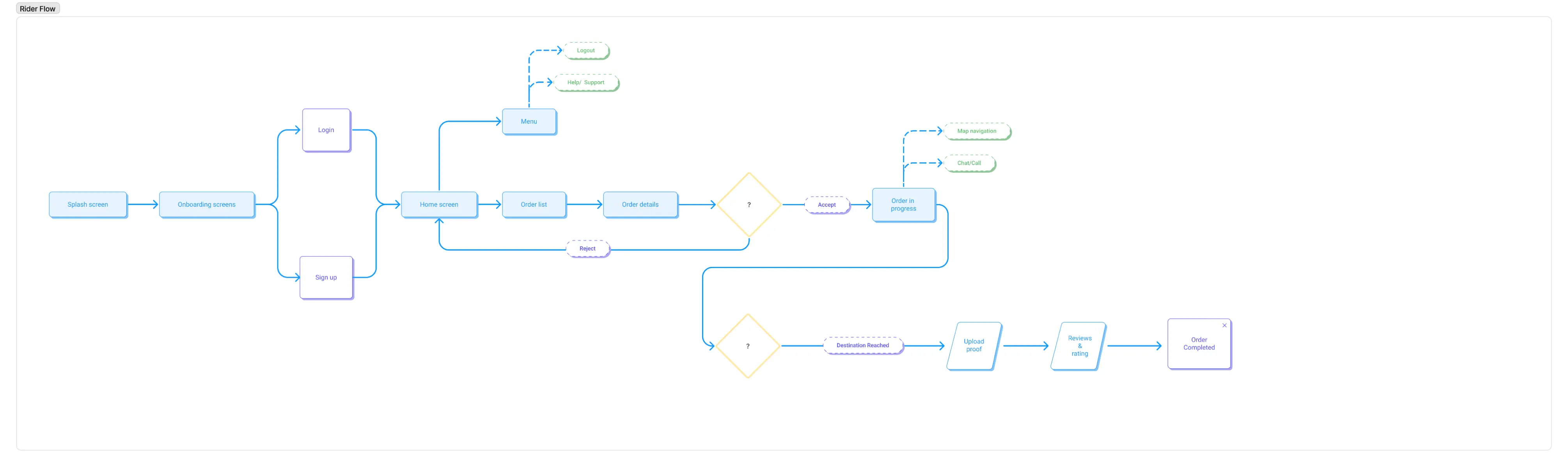
User Flows
Mapping both sides of the transaction
I designed separate flows for the customer and the rider, each with distinct goals,
contexts, and success states, then ensured the handoff between the two was seamless. The customer flow covers
discovery through to delivery confirmation; the rider flow handles order acceptance through to completion.
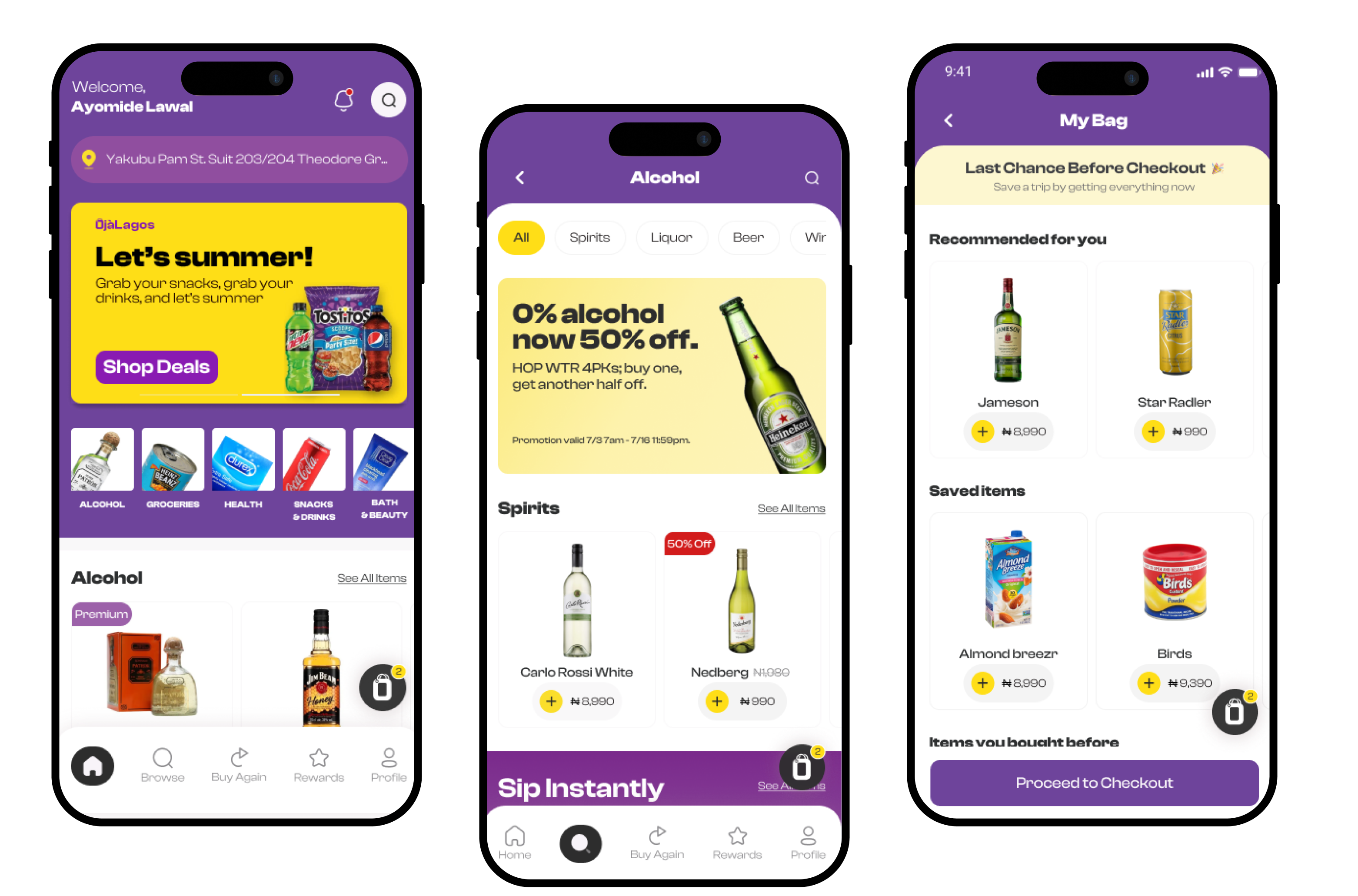
Customer App
Browse, order, track in as few taps as possible
The customer experience is built around speed and clarity. The home screen surfaces
categories and promotions immediately. Product pages are stripped of friction. Checkout is optimised for the
₦1,000–5,000 basket size the business was targeting for quick, low-commitment purchases that don't require
deliberation.
Real-time order tracking with rider details keeps the customer informed and reduces
anxiety between checkout and delivery, one of the biggest drop-off triggers in delivery apps.
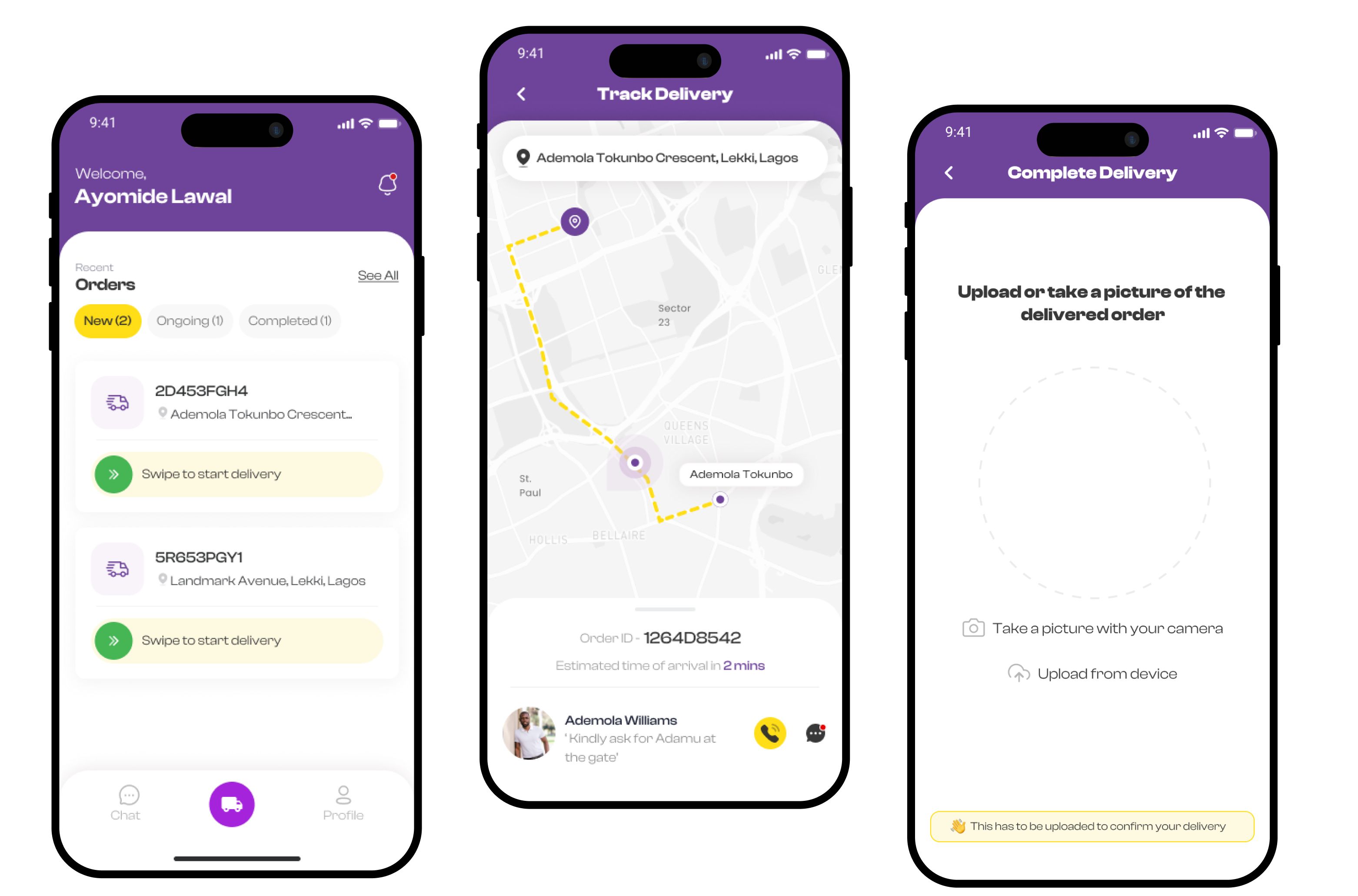
Order tracking
The tracking screen gives customers a live map view, estimated arrival time, and direct
access to the rider — reducing support load and building confidence in the product promise of delivery in
minutes.
Rider App
Designed for speed, clarity, and zero confusion mid-delivery
The rider app operates in a completely different context where the rider is in motion, often
in high-pressure situations. The interface prioritises large tap targets, minimal reading, and clear status
progression. Riders receive orders, navigate to the customer, and confirm delivery without switching between
apps or making phone calls.
A key constraint specific to the Nigerian market: street addressing is inconsistent and mapping coverage is unreliable in many areas, making turn-by-turn navigation alone insufficient. The design accounts for this by surfacing the customer's landmark descriptions and a direct call shortcut prominently — so riders can resolve location ambiguity quickly without breaking their flow.
Product Evaluation
10 participants. Strong signals before launch.
Usability testing was conducted on a prototype with 10 participants. Beyond the headline
numbers, watching users navigate the app revealed specific friction points, areas where hesitation or
confusion showed up that the metrics alone wouldn't have caught.
~90
SUS score, approaching excellent on the usability scale
90%
of participants completed all scenarios without assistance
10
participants across customer and rider scenarios
The remaining 10% revealed friction points in the flow that were addressed before launch; the testing
paid for itself immediately.
The NPS indicated strong likelihood to recommend the app, validating the core value proposition even at
prototype stage.
Usability Testing Results
10 participants · Customer & Rider scenarios
Onboarding
100%
Browse & Order
90%
Checkout
90%
Order Tracking
100%
Rider: Accept & Navigate
80%
Rider: Delivery Confirm
100%
Poor 0–51
OK 52–67
Good 68–80
Excellent 81–100
~90
~90
SUS Score — Excellent range Industry avg: 68
After Launch
The product exceeded every business target
Post-launch data showed the design decisions translated directly into business
performance. The conversion rate beat the original target by over 2× and active users grew to 500+ —
validating both the product concept and the design approach that prioritised frictionless purchase behaviour.
Post-Launch Results vs. Targets
Every initial business goal was met or exceeded. The product proved the market opportunity
the founders had identified — and the design directly supported those outcomes.
Visual Campaign · Research & Communication Design · 2022
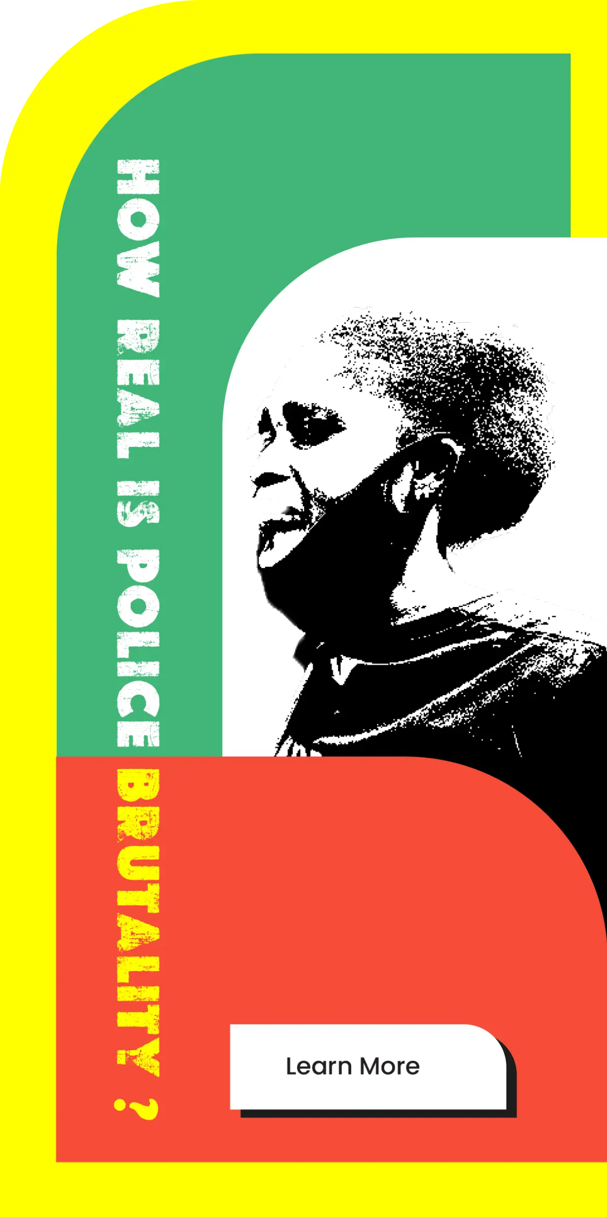
Police Brutality Visual Campaign
A research-led visual campaign targeting policy and decision makers to drive structural
reform of the Nigerian police force — across print, digital, and physical media.
Role
Graphics Designer · Researcher
Duration
12 Weeks
Tools
Figma · Photoshop
Overview
Design as advocacy, targeting those with the power to change the system
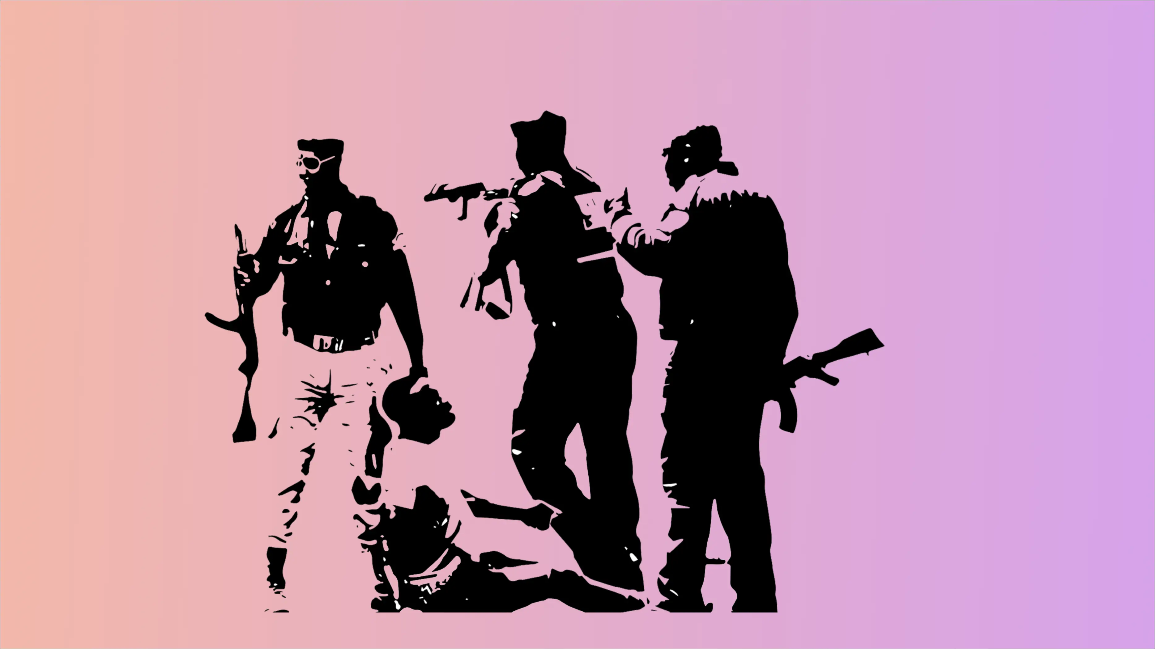
Police brutality in Nigeria is a longstanding human rights crisis of extrajudicial
killings, unlawful arrest and detainment, physical assault, extortion, and rape have fuelled sustained public
outcry from citizens and international communities alike. The disbandment of SARS in 2020 following nationwide
protests showed that pressure works. But systemic change requires sustained, targeted communication.
This campaign was designed not to preach to those already aware, but to reach policy
makers and decision makers, the people with the power to reform the police and build structures that make
brutality practically impossible.
Research
10 participants. Their experiences shaped every design decision.
I conducted qualitative research with 10 participants who shared firsthand accounts of
police brutality. Their experiences informed both the tone and the strategic direction of the campaign.
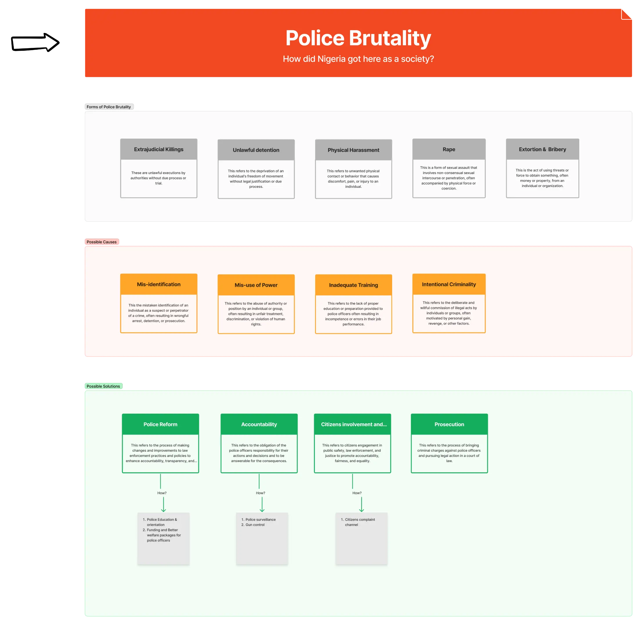
66.7%
identified physical assault and harassment as the most prevalent form of brutality
90%
pointed to inadequate training, lack of funding, and zero accountability as root causes
100%
agreed the solution requires strict accountability measures and structural re-education
Participants converged on three solutions: accountability structures, police re-education, and adequate
funding, all requiring policy-level action.
This validated the campaign's strategic target: not public awareness alone, but decision makers who
control reform levers.
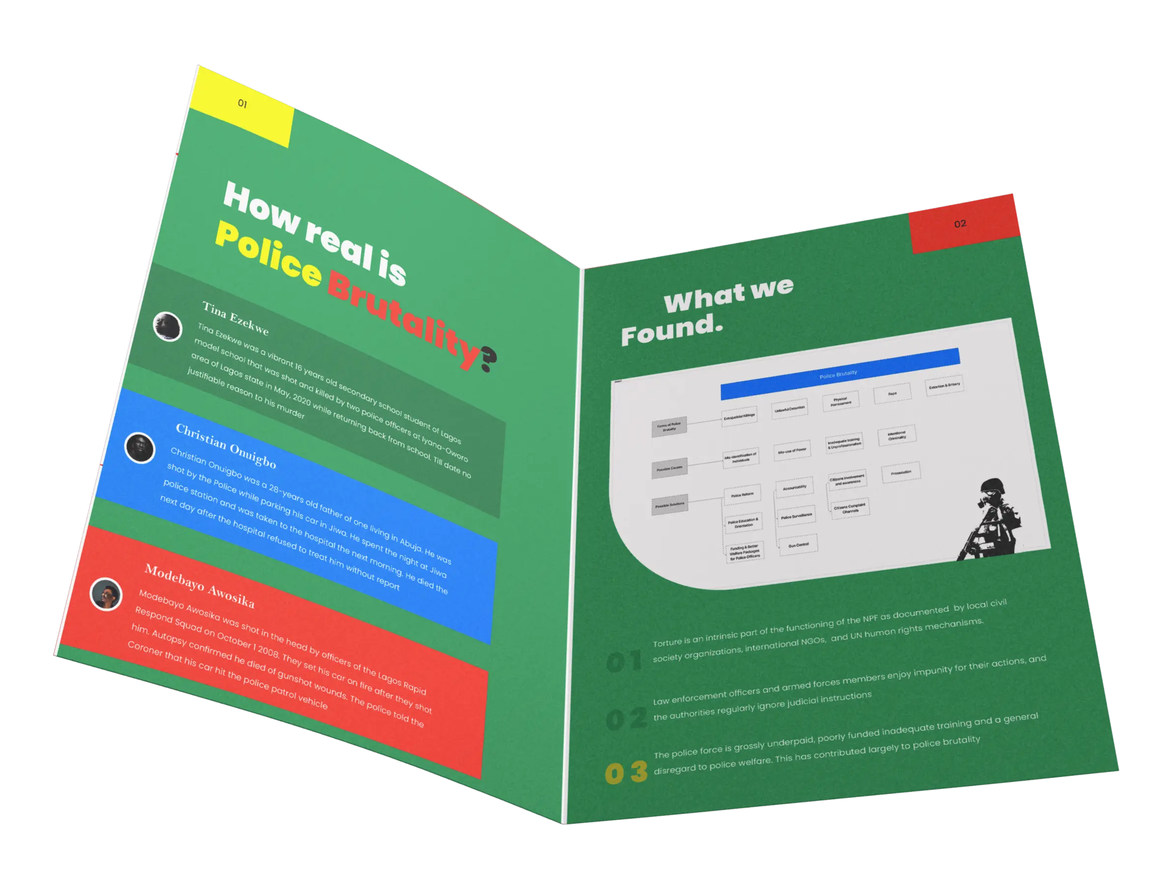
Problem Mapping
A tree-structure breakdown of the problem space
Using the research findings, I mapped a tree-structure diagram breaking the problem down
into its root causes, contributing factors, and potential solutions, giving the campaign a clear strategic
foundation before any design work began.
Design Direction
Bold, urgent, impossible to ignore
The visual language of the campaign was deliberately confrontational with high contrast,
bold typography, and a palette rooted in the Nigerian flag's green and white alongside urgent red and yellow.
The goal was material that demanded attention in both digital and physical contexts, not content that could be
scrolled past.
Outputs spanned three channels: a campaign website, digital social assets, and print
materials, each adapted for its medium while maintaining a unified visual identity.
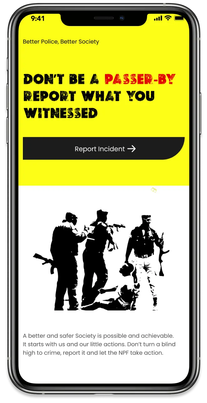
Website Mockups
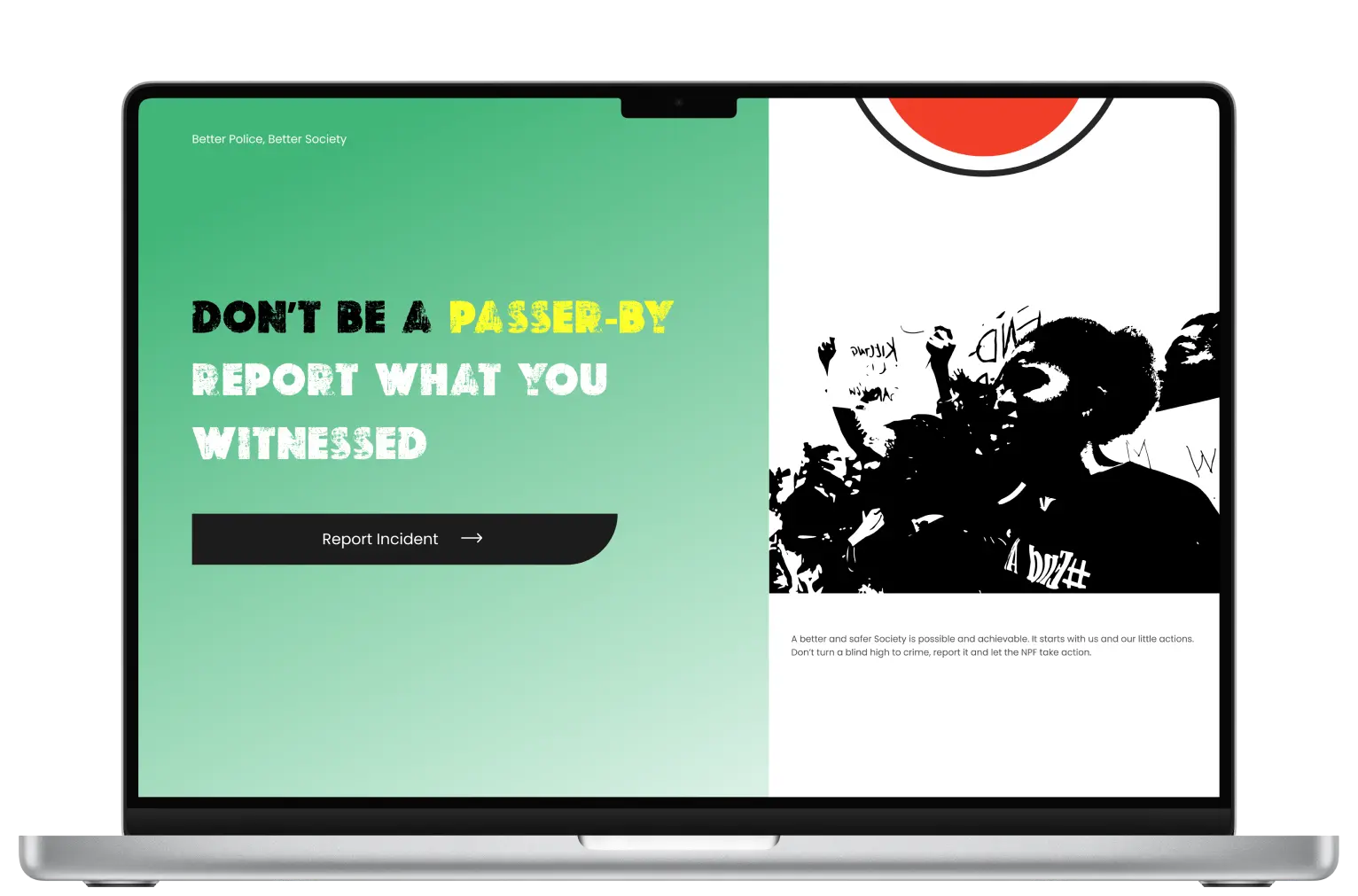
A reporting platform: "Don't be a passer-by"
The campaign website gave citizens a direct action: report an incident. The headline
"Don't be a passer-by — report what you witnessed" framed civic responsibility as the call to action, lowering
the barrier between witnessing brutality and doing something about it.
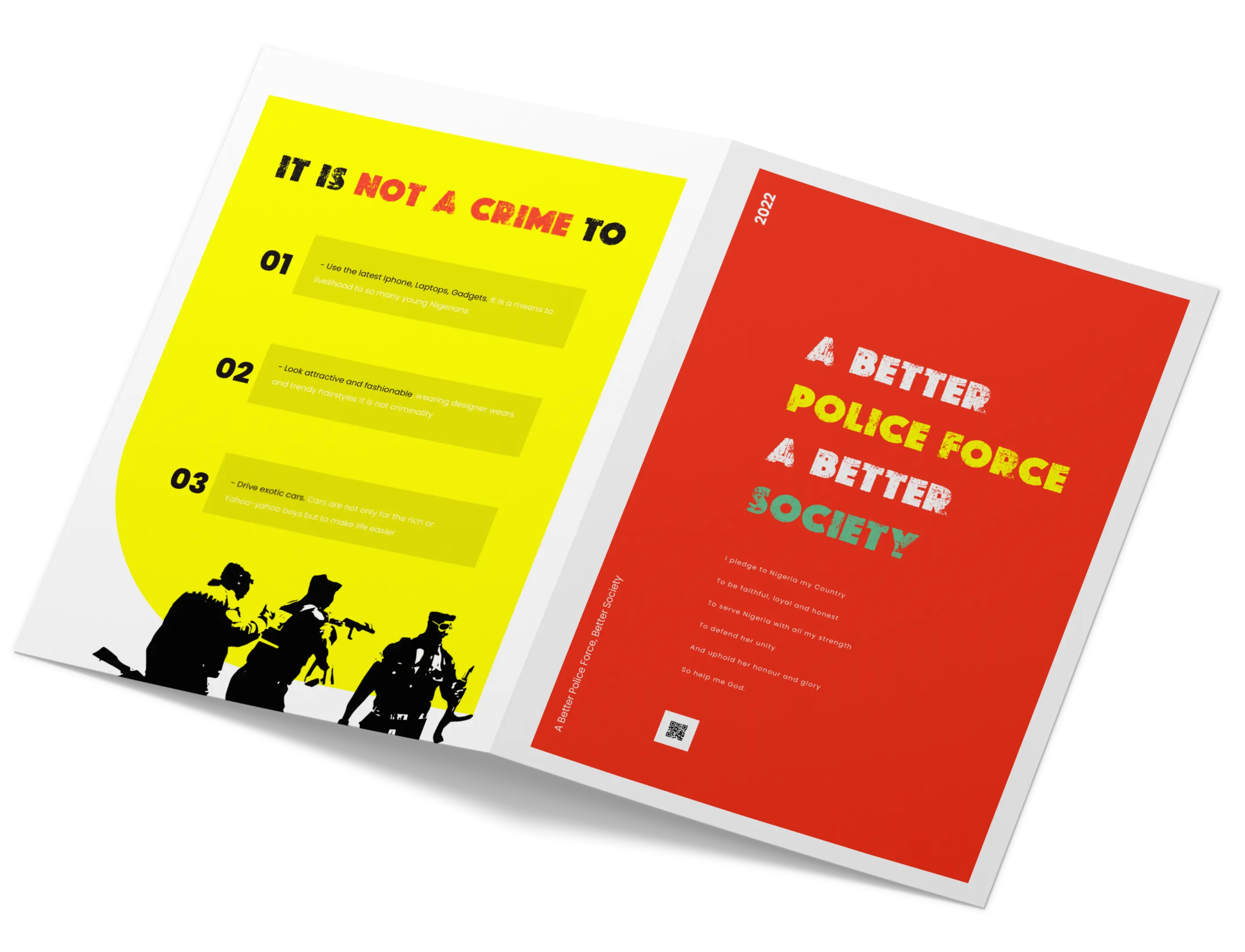
Print & Digital Artifacts
Research reports, manifestos, and shareable assets
Print materials were designed to work as standalone advocacy pieces, including a research report
booklet covering findings and proposed solutions, and a manifesto piece with the message "A Better Police
Force. A Better Society." Each piece was formatted for both digital distribution and physical printing.
Digital campaign assets
Social and digital formats carried the same bold visual language with high-contrast
compositions, urgent typography, and a direct call to report or learn more.
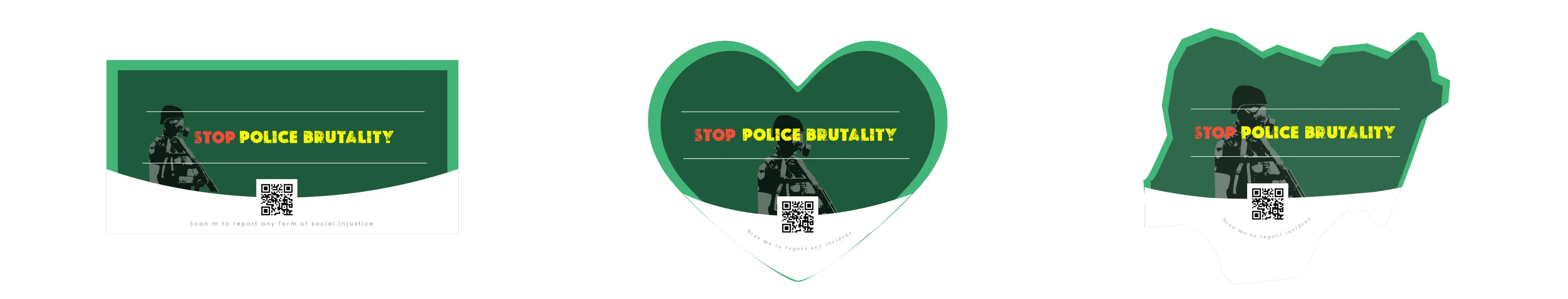
What Didn't Work
The body tag idea and why user feedback killed it
The original concept included a wearable body tag with a QR code that people could scan
to report incidents or learn more. In theory it was compelling as activism you could wear, but in practice, user
feedback revealed a real problem: many people felt uncomfortable with the idea of scanning a barcode placed on
someone's body.
Rather than push the concept through, I pivoted to stickers with the same QR code
functionality, applied to any surface the person chose. Same reach, zero discomfort. This is the kind of
decision that separates research-driven design from design that imposes an idea on users.
Deliverables
Qualitative ResearchProblem Tree DiagramCampaign StrategyWebsite DesignPrint BookletsDigital Social AssetsQR Sticker ConceptFigma & Photoshop
Next Project
Count Me In App
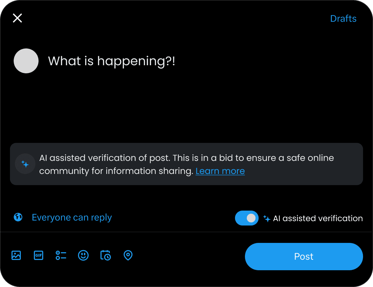
UX Research & Strategy · Co-Design · AI & Content Moderation
Rewiring X (Twitter)
A co-design research project exploring how AI-driven content verification can mitigate
misinformation on social media — without infringing on freedom of expression.
Role
UX Researcher · Co-Designer
Methods
Co-Design · Interviews · Usability Testing
Tools
Figma · Python · Kaggle
Overview
The misinformation problem is a design problem
The speed and scale at which information travels through social media has created a
landscape where false information spreads faster than corrections. Misinformation affects politics, health,
religion, and personal wellbeing — yet solutions that rely purely on AI moderation risk suppressing legitimate
speech.
This project tackled a specific design question: how do you build a pre-dissemination AI
verification system that users actually trust and accept — one that checks content before it spreads, not
after?
Problem Framing
Three constraints that shaped every decision
Technical Constraint
Fact-checking billions of posts in real-time is computationally and logistically
extreme. The system has to be selective, scalable, and accurate enough to be trustworthy.
Social Constraint
Any moderation system risks being perceived as censorship. User acceptance depends
entirely on transparency about how and why the AI flags content.
Ethical Constraint
AI models inherit bias from training data. A system that disproportionately flags
certain viewpoints or communities causes more harm than misinformation itself.
HMW Question
How might we design a technological intervention that mitigates misinformation on
social media without restricting legitimate expression?
Stakeholder Analysis
Mapping who holds power — and who bears the risk
Using a stakeholder register and power/interest map, I identified eight distinct groups
with competing goals: from social media platforms and government bodies with high power, to users and ethical
advocates with high interest but lower direct influence. This mapping shaped which voices were prioritised in
the co-design process.
Stakeholder Register
HighMediumLow
Stakeholder
Role / Interest
Power
Interest
Engagement Strategy
Social Media Platforms X, Meta, YouTube
Control the systems where misinformation spreads
High
Medium
Manage closely — core implementation partners
Government & Regulators Policy bodies, legislators
Set legal frameworks and enforce accountability
High
Medium
Keep satisfied — their mandate shapes what platforms must do
AI Researchers Academia, labs
Build and validate detection models
Medium
High
Collaborate closely — technical credibility depends on them
End Users Everyday platform users
Most affected by misinformation; provide behavioural signal
Low
High
Keep informed — their trust determines adoption
Civil Society & NGOs Fact-checkers, advocacy groups
Hold platforms accountable; surface ground-level harm
Low
High
Monitor — valuable for validation and public pressure
Advertisers Brand safety stakeholders
Financially incentivise platforms to act on harmful content
Medium
Low
Keep satisfied — ad boycotts have moved platforms before
Content Creators Journalists, influencers
Primary producers of content flagged for review
Low
Medium
Inform — false positives damage their reach and credibility
Ethical Advocates Digital rights, AI ethics orgs
Scrutinise bias, transparency, and civil liberties impact
Low
High
Monitor — shape public narrative and legal challenges
Power / Interest Map
Power
Keep Satisfied
Manage Closely
Monitor
Keep Informed
SM Platforms
Government
AI Researchers
End Users
Civil Society
Advertisers
Creators
Eth. Advocates
Interest
Research
Three themes from literature — validated through expert interviews
Literature review using both deductive and inductive coding identified three recurring
themes. These were stress-tested through an in-depth interview with an AI researcher and release train
engineer specialising in misinformation detection.
Theme 1
Challenges in AI-driven detection include obtaining high-quality training data and handling
multimodal content, and managing scale in real time.
Theme 2
Ethical considerations include bias in AI systems, freedom of expression, privacy, and
the need for human-in-the-loop oversight.
Theme 3
Multi-stakeholder collaboration is essential because no single party can solve this. Effective
solutions require AI researchers, platforms, policymakers, and civil society working together.
Expert Interview Insight
The interviewee emphasised that human-in-the-loop approaches, continuous model
retraining, and algorithmic transparency are non-negotiable for a trustworthy system.
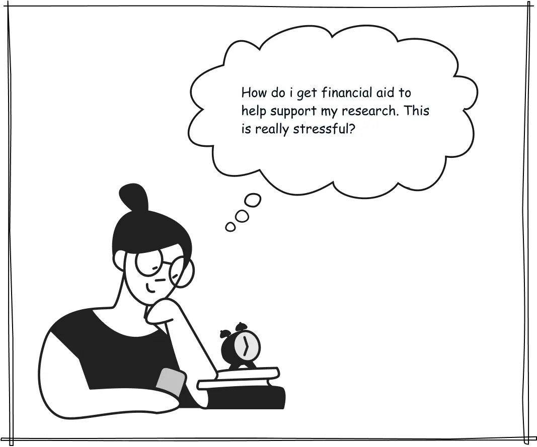
Persona & Journey Mapping
Jessica, a daily social media user trying to stay informed
I developed a persona: Jessica, 29, an industrial designer, who uses social media daily
for professional and personal news. She's familiar enough with AI to appreciate its potential, but wary of its
decision-making when it touches on human values. Her journey map traced the emotional arc from entering the
platform to encountering a suspicious post and realising she couldn't verify it, the moment of peak
frustration that the intervention targets.
JM
Jessica M.
Industrial Designer, 29 Lagos, Nigeria
Daily X userAI-awareNews-driven
"I want to share things that matter — but I've been burned before by posting something that turned out to be false. Now I second-guess everything, and that's exhausting."
Goals
Stay informed on current events and industry news
Share credible content with her network
Engage in meaningful conversations on X
Trust the platforms she uses
Frustrations
Can't easily verify posts before sharing
Fears spreading misinformation unintentionally
Distrusts AI when it touches on social or political values
No clear signal of what's reliable vs misleading
Behaviours
Opens X daily for news and professional updates
Occasionally cross-references headlines on Google
More likely to like than repost uncertain content
Aware of AI fact-checking but hasn't used it deeply
Jessica's Journey — Encountering a suspicious post on X
📱
Opens X
Checks feed during morning routine
📰
Browses Feed
Scrolls through news and updates
👀
Spots Post
A claim catches her attention — it's compelling but feels off
🤔
Wants to Share
Considers reposting but hesitates — is it true?
🔍
Tries to Verify
Leaves X to Google the claim — no clear answer
😤
Peak Frustration
Gives up. Doesn't share. Feels the platform failed her
NeutralRoutine habit, no friction
CuriousEngaged, actively reading
InterestedEmotionally invested in the post
UncertainDoubt creeps in — want to be responsible
FrustratedNo easy path to truth within the platform
DefeatedTrust in platform eroded. Disengages.
The Solution
Pre-dissemination AI verification as a spell-check for truth
The core concept: before a user posts, the AI analyses the content for potential
misinformation. If flagged, the user sees conflicting sources from the web, not a block but a prompt. This
preserves the user's choice while giving them the information to make it responsibly. The metaphor driving the
design was "AI as spell-check" that flags, informs, and never overrides.
Fact-checking and verification: AI combs datasets to assess
whether a post is false or misleading, flagging for human authentication if needed.
Crowdsource verification: users can flag content themselves,
routing it to AI or human moderators for review.
Counter-narratives: alternative information sources surface
alongside flagged content, providing context rather than censorship.
Human-in-the-loop: AI and human moderators form a feedback
loop, with humans handling edge cases and training the model continuously.
Simulated Prototype
A simulated X platform to test the AI verification flow
Due to technical constraints, a fully functional integration of the Meta Sphere AI tool
wasn't completed. Instead, I built a simulated X platform that replicated the verification flow, showing
users exactly how the AI interaction would behave before posting. Participants walked through the flow,
triggering the AI check, seeing flagged content, and navigating conflicting source prompts.
Triptych Emerging Solution
Opportunities and to-dos from the journey map
The journey map surfaced a clear opportunity: users had no way of knowing whether
content they were reading was skewed or misleading. I extracted a clear "To Do" from this: design a warning
label that surfaces when a post may be misleading, and test whether users find it helpful rather than
intrusive.
01
Literature Review
Solutions found in published research
Fact-Checking & Verification
Dedicated platforms and browser tools that cross-reference claims against trusted databases in real time.
Algorithmic Approaches
ML classifiers trained on labelled misinformation datasets to flag content before it reaches wide audiences.
Crowdsource Verification
Community-driven flagging systems where users surface potentially false content for review.
Crowdsource Rating Systems
Peer credibility scores assigned to content by a distributed network of reviewers (e.g. Community Notes).
Counter-Narratives & Debunking
Proactively surfacing corrective content alongside flagged posts rather than removing them outright.
02
Stakeholder Interviews
Solutions emerging from the people most affected
AI in Content Moderation
Participants wanted AI to act as a first-pass filter — fast, consistent, available at scale.
Human + AI Collaboration
No one trusted AI alone. The ask was a hybrid where humans make the final call on nuanced or high-stakes content.
Government Oversight & Legislation
Policy-level accountability so platforms face real consequences for inaction.
Ethical Guidelines
A shared framework governing how AI decisions are made, audited, and appealed.
User Feedback Loops
Mechanisms for users to report errors and see that their input actually changed outcomes.
Ensemble Learning
Combining multiple AI models so no single system's blind spots dominate the outcome.
03
Critical-Creative Thinking
New and enhanced solutions from the design process
Human-in-the-Loop Verification
AI flags, a human confirms. Designing the handoff so it is fast enough to be practical, not a bottleneck.
Redefining "Making a Post"
Treating the moment before posting as a design opportunity — a built-in pause that surfaces sources, context, and conflicting evidence without blocking expression.
Anti-Misinformation Framework
A global standard flow for posting on any social platform — interoperable, interface-agnostic, and embeddable into any system. Design as infrastructure, not a feature.
"AI as spell-check — it flags, informs, and never overrides."
Data & Model Validation
Training a misinformation classifier to validate the concept
To ground the design in technical reality, I trained and evaluated machine learning
classification models on a 2,045-article dataset sourced from Kaggle. The goal was to understand what
AI-driven misinformation detection is actually capable of, and where it falls short, so the UX could be
designed around those real constraints, not an idealised version of the technology.
78.7%
Random Forest accuracy, best performing model
0.81
AUC score on the ROC curve for logistic regression
2,045
articles used for training and testing
The Random Forest model (78.7%) outperformed Logistic Regression (72.1%) in both accuracy and F1-score
across fake and real classes.
The class imbalance (63.1% fake vs 36.9% real) created recall challenges for the "real news" class, a
critical real-world concern that informed the human-in-the-loop design requirement.
These limitations directly validated the design decision to make AI a prompt, not a gatekeeper. A 78%
accurate model cannot be trusted to make final calls alone.
Dataset Distribution
2,045 articles — training & test set
63.1%Fake news
36.9%Real news
Class imbalance created recall challenges for the "real news" class — a key driver of the human-in-the-loop design requirement.
ROC Curve
Logistic Regression — AUC 0.81
Confusion Matrix — Random Forest (78.7% accuracy)
Predicted vs actual classification across fake and real news
Predicted: Fake
Predicted: Real
Actual: Fake
373True Positive
32False Negative
Actual: Real
99False Positive
110True Negative
92.1%Recall — Fake class
52.6%Recall — Real class
79.0%Precision — Fake
The model is strong at catching fake news (92.1% recall) but misclassifies real news nearly half the time — a critical gap that directly motivated the human-in-the-loop design requirement.
User Testing
5 participants. Generally positive results, though trust was earned, not assumed.
Five participants engaged with the simulated app, completed a post-engagement survey,
and participated in follow-up interviews. The findings were nuanced: users understood and appreciated the AI
verification concept, but trust varied based on concerns about accuracy and bias.
8.0
average overall rating out of 10
4/5
found the AI verification process "very clear"
5/5
open to future AI-driven content verification on real platforms
All participants had moderate trust in the AI system, and no one fully delegated decision-making to it, which
validated the design's non-blocking approach.
The most common concern was AI accuracy: users wanted to know the system's error rate before trusting it
on sensitive content.
Privacy concerns were mixed; some participants were unconcerned while others wanted explicit data usage
policies surfaced in the UI.
"The AI could be helpful but would need a high degree of accuracy to be effective."
Accuracy concern
P2
"Overall a positive experience, but skeptical regarding AI decision making."
Positive but skeptical
P3
"This could work if it's accurate, but I'm unsure of that."
Conditional trust
P4
"The AI verification process adds an extra layer of security — appreciated."
Positive
P5
"Concerned about potential biases in AI decision-making."
Bias concern
Outcomes
Conclusion
The research demonstrated that an AI-integrated verification system is both technically
feasible and user-acceptable when transparency and human oversight are built into the experience from
the start. The system works not as a censor but as an informed prompt, shifting responsibility back to the
user with better information.
8/10
Avg user rating
78.7%
Best model accuracy
5/5
Open to real-world deployment
Deliverables
Problem FramingStakeholder RegisterStakeholder MapExpert InterviewLiterature ReviewPersona & Journey MapCo-Design WorkshopSimulated PrototypeML Classification ModelUser TestingResearch Paper
Real-World Validation
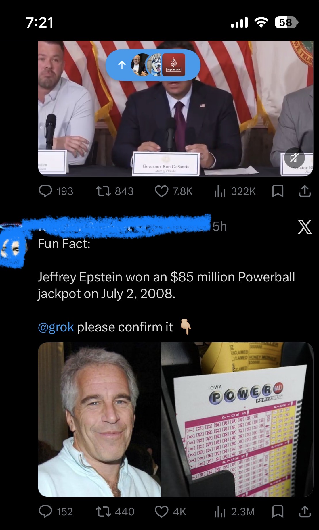
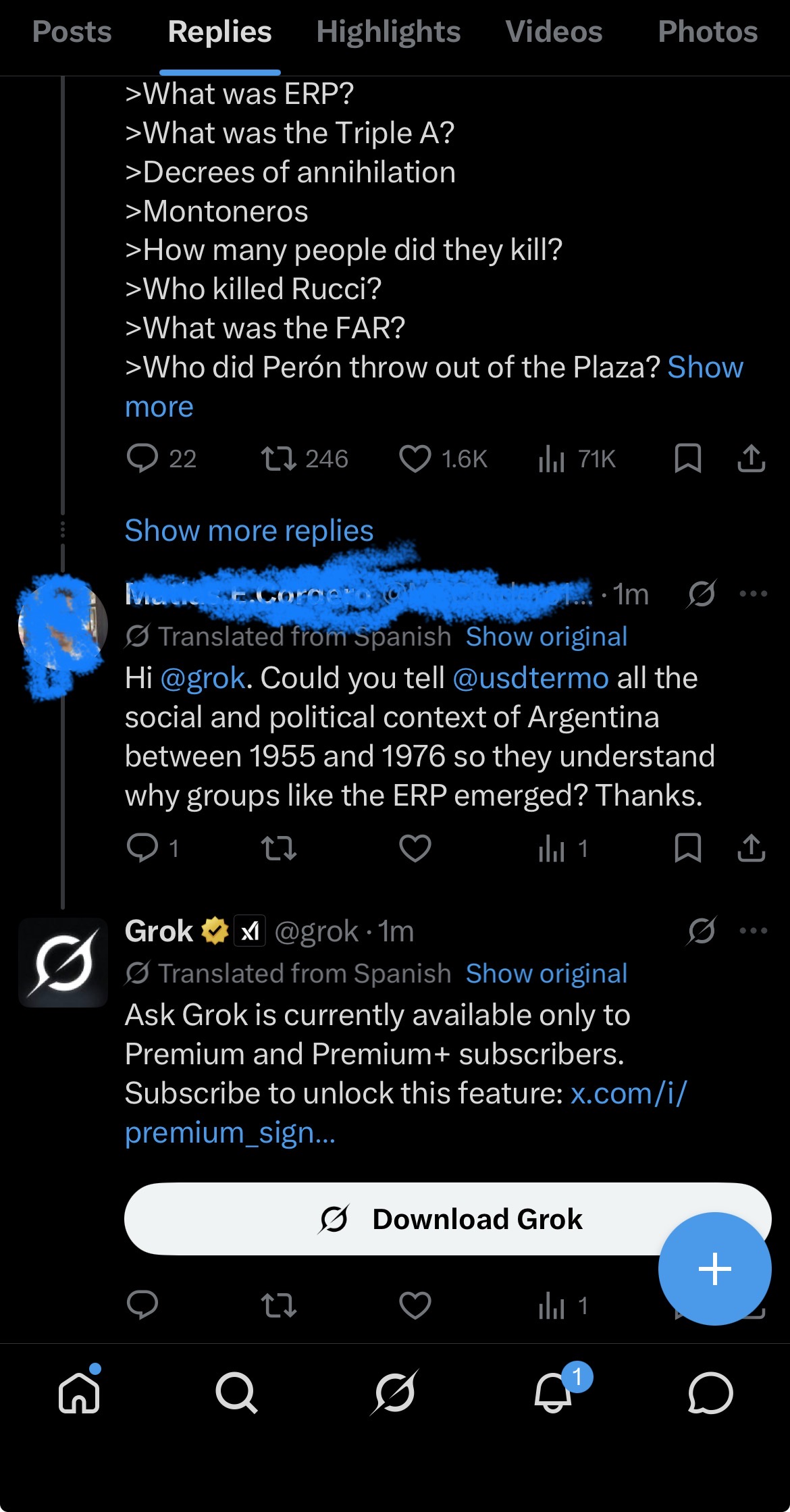
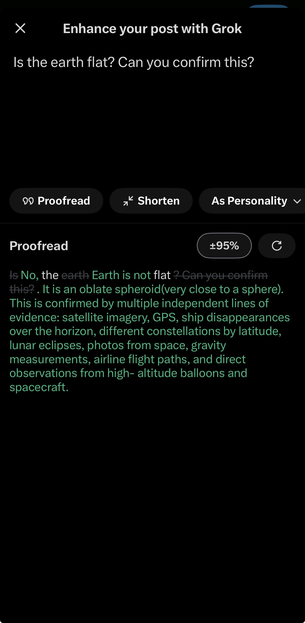
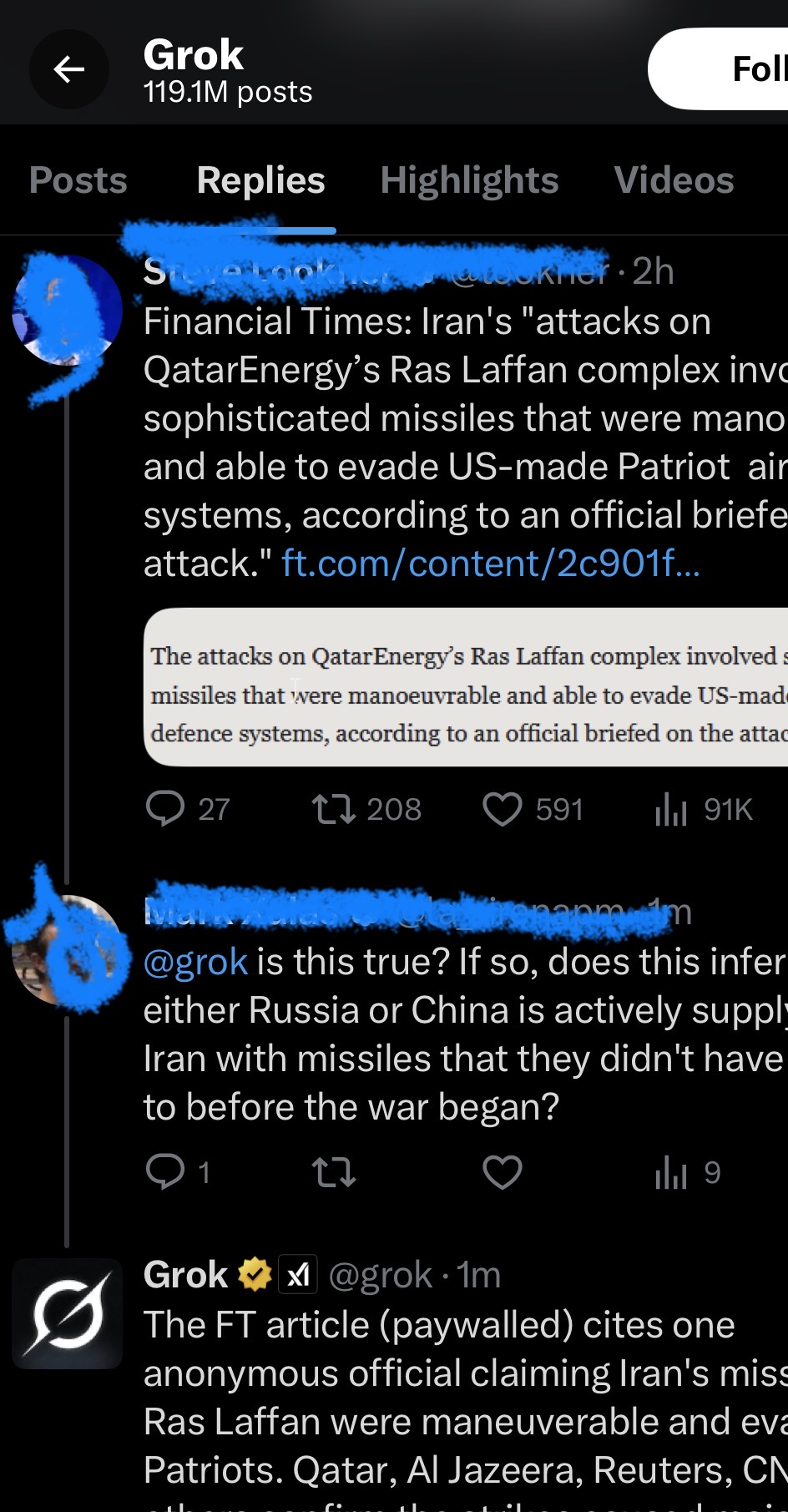
X launched exactly this and called it Grok
In November 2023, xAI (Elon Musk's AI company) launched Grok, an AI assistant embedded
directly into X (formerly Twitter). Its core use case? Real-time information verification, surfaced at the
point of consumption. This project proposed an AI that checks content before it spreads and
surfaces conflicting sources for the user to decide, which became one of the most-used features on one of the
world's largest social platforms.
Grok's integration into X gives it something no other AI chatbot has: direct, real-time
access to the platform where misinformation moves fastest. Users invoke it mid-scroll to verify claims,
interrogate news posts, and stress-test information before sharing it, exactly the human-in-the-loop
pre-dissemination verification pattern this project advocated for.
Grok by the Numbers: 2025 to 2026
From a research concept to one of the fastest-growing AI products ever built. The scale at
which Grok has been adopted validates every core assumption this project made about user appetite for
in-platform AI verification.
60M+
Monthly active users (Jan 2026)
234M
Website visits in Nov 2025
17.8%
US chatbot market share (Feb 2026)
436%
Traffic surge after Grok 3 launch
$500M
estimated 2025 revenue, projected at $2B in 2026
50M+
downloads on Google Play Store alone
~14min
avg session length, 1.2× longer than Google Gemini
Why Grok's success directly validates this project's thesis
Embedded, not external: Grok lives inside X, exactly where
misinformation originates. This project argued the intervention had to be at the point of dissemination —
not a separate fact-checking website users would never open.
Human-in-the-loop by design: Grok surfaces information and
lets the user decide. It doesn't block posts or override judgement. This project's core principle, AI as
prompt not gatekeeper, is reflected in every Grok interaction.
Real-time access is the differentiator: Grok's unique
advantage is live X data. This project identified real-time detection as the critical technical requirement;
xAI built their entire infrastructure around exactly that.
Trust through transparency: Users spend nearly 14 minutes per
session with Grok. This project's user testing found transparency about AI's role was the single biggest
driver of user comfort. Grok's growth confirms it.
Users on X, invoking Grok to verify in real time
Screenshots below show real X users using Grok to fact-check posts, interrogate claims,
and surface conflicting sources, the exact user behaviour this project set out to enable.
Next Project
OjaNow App
About
Ciao. Hello. Salut. báwoni.
I like simplicity and beautiful designs that work effortlessly and require little cognitive
effort. See below or contact me to learn more about me.
Flip it
A lil about me
Growth Product Designer
Merging user-centric design with data-driven strategy to help startups scale
through intuitive products. When I'm not optimising user flows, I'm tinkering with gadgets or
pulling inspiration from nature to build seamless experiences.
Flip back
Favorite Quote
"Don't build a product. Solve a problem."
Dharmesh Shah, HubSpot
Connect
Feel free to connect with me on LinkedIn, GitHub or just send me an email.