Map & Target
Firstly, I grouped the reviews from play store, to see patterns and recurring pain points from different users. This gave me a direction on how to proceed and a view on how users are feeling.
Heuristic Evaluation
Adopting Jakob Nielsen’s 10 usability principles as the metrics for the evaluation- focusing on the functionality, layout & design and conversion points of the app. I was able to identify some friction points and areas to improve. But I must commend the consistency maintained on the app.
*Usability severity percentage taking into account all the 10 heuristics of Jakob Nielsen
🚨 The major usability flaws in the website are the navigation structure and its aesthetics. The unclear navigation and users not having the freedom and control made the app quite unpleasant to use.
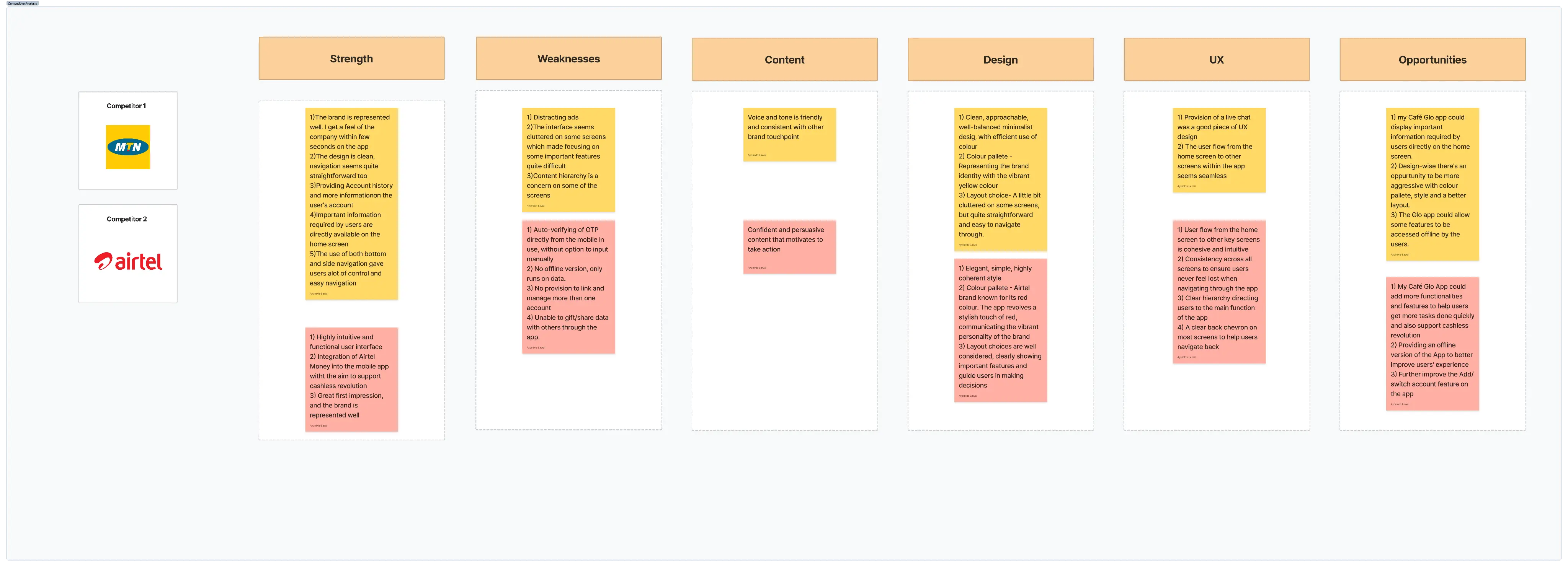
Competitive Analysis
A small number of firms have the majority of the market share (MTN, AIRTEL, GLO and 9MOBILE), this has created fierce competition and they are always in the race to outperform one another.
User Research
Having a one-on-one interaction with the existing users was important for me. In order to have a clearer perspective and a more detailed understanding of what other users could be going through.
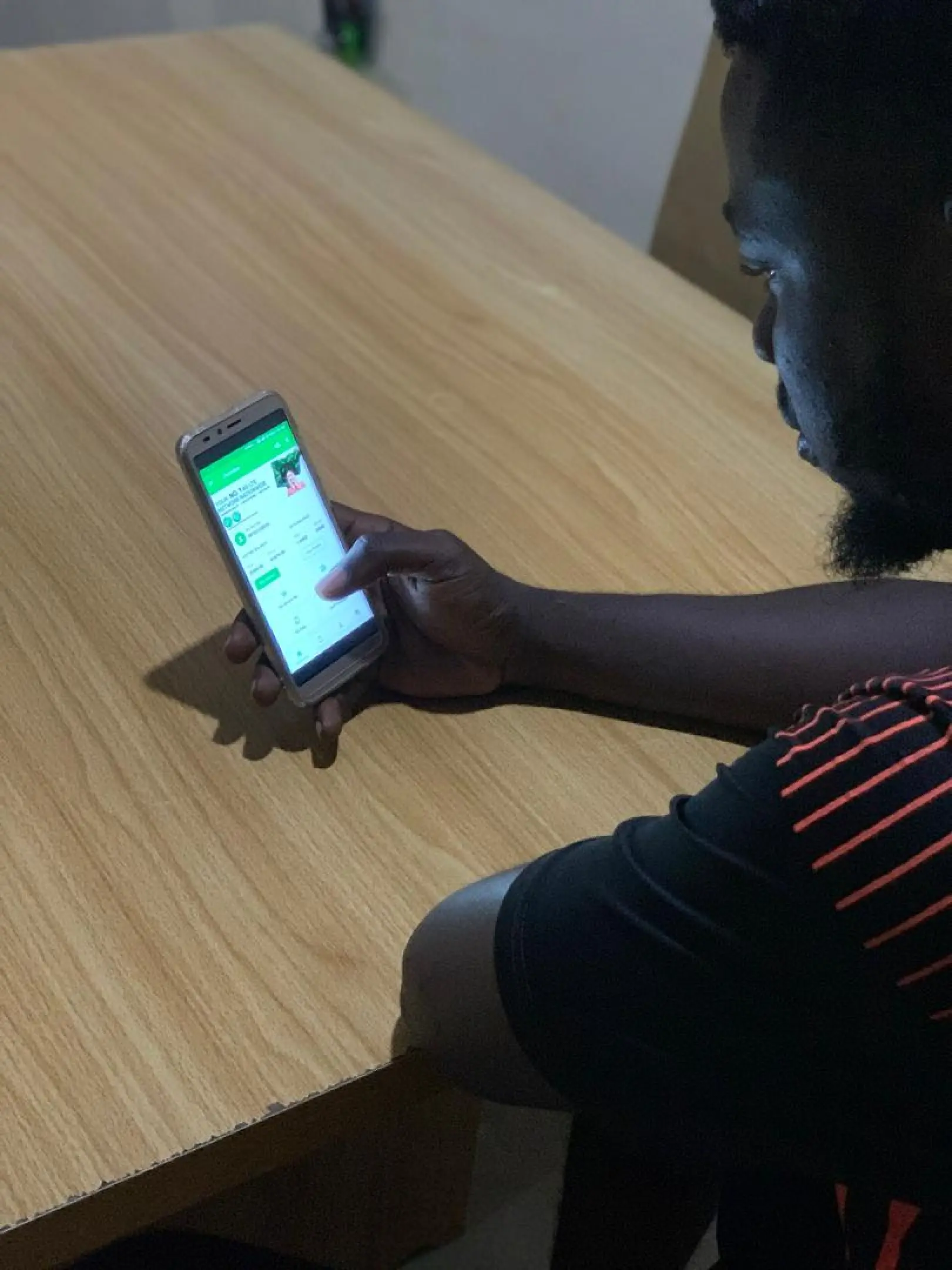
I watched users navigate through the app while performing some tasks and was taking note of their feedbacks. All in all, I tried to get feedback from users based on their overall feel of the app and also based on the task given.
😊 Findings
Major Focus -From the interviews and researches conducted, I identified these areas to improve on to make the app better.
1) A better onboarding experience
2) Easier navigation through the app
3) Integrating more features and functionalities that meet users' needs
4) Improve the UI design of the app
Sketch & Decide
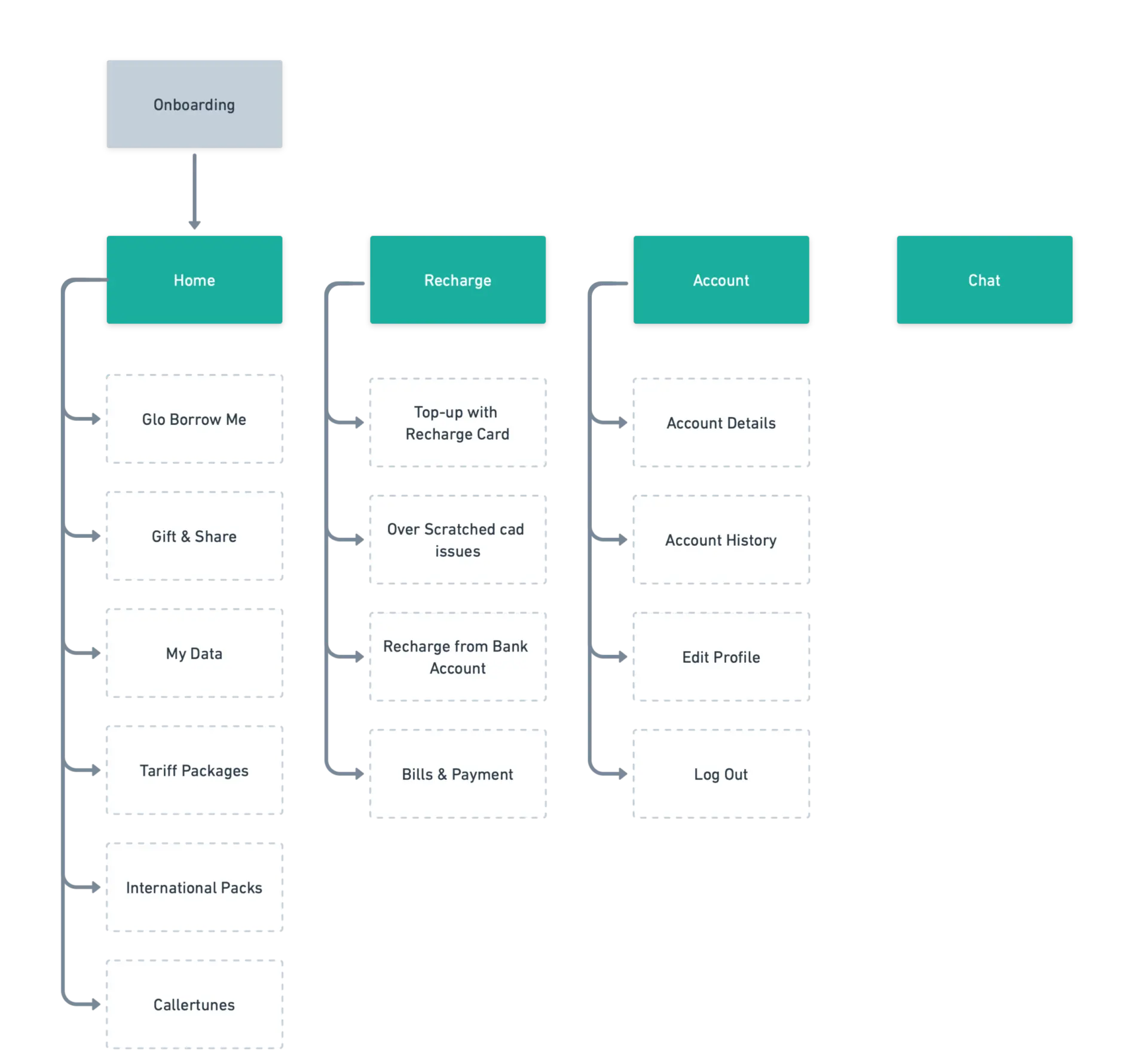
Going further, after identifying some of the major features and the need to include some features, I mapped out an information architecture to give me an idea on how to organize the content.
User Flow
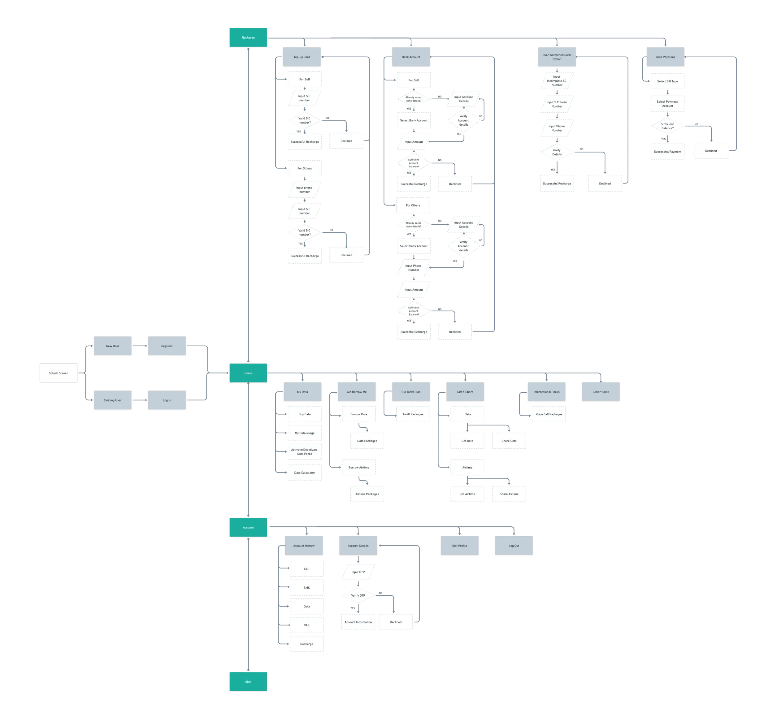
Ensuring a flow that was seamless and cohesive for users was a priority. Moving on from the IA, I started the user flow showing the major interactions between different screens of the app.
Paper Sketches
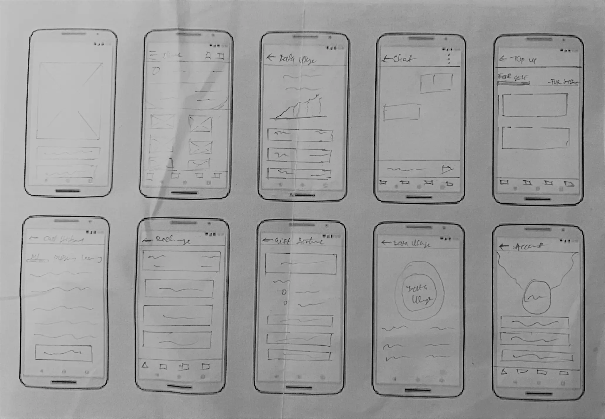
Paper sketches was a good starting point, it helped in the brainstorming of how the layouts and arrangement of elements should be. Achieving a clean and simple layout was a priority, in order to help users navigate quickly and focus on the details.
Defining the Solutions
Paper sketches was a good starting point, it helped in the brainstorming of how the layouts and arrangement of elements should be. Achieving a clean and simple layout was a priority, in order to help users navigate quickly and focus on the details.
Home Screen
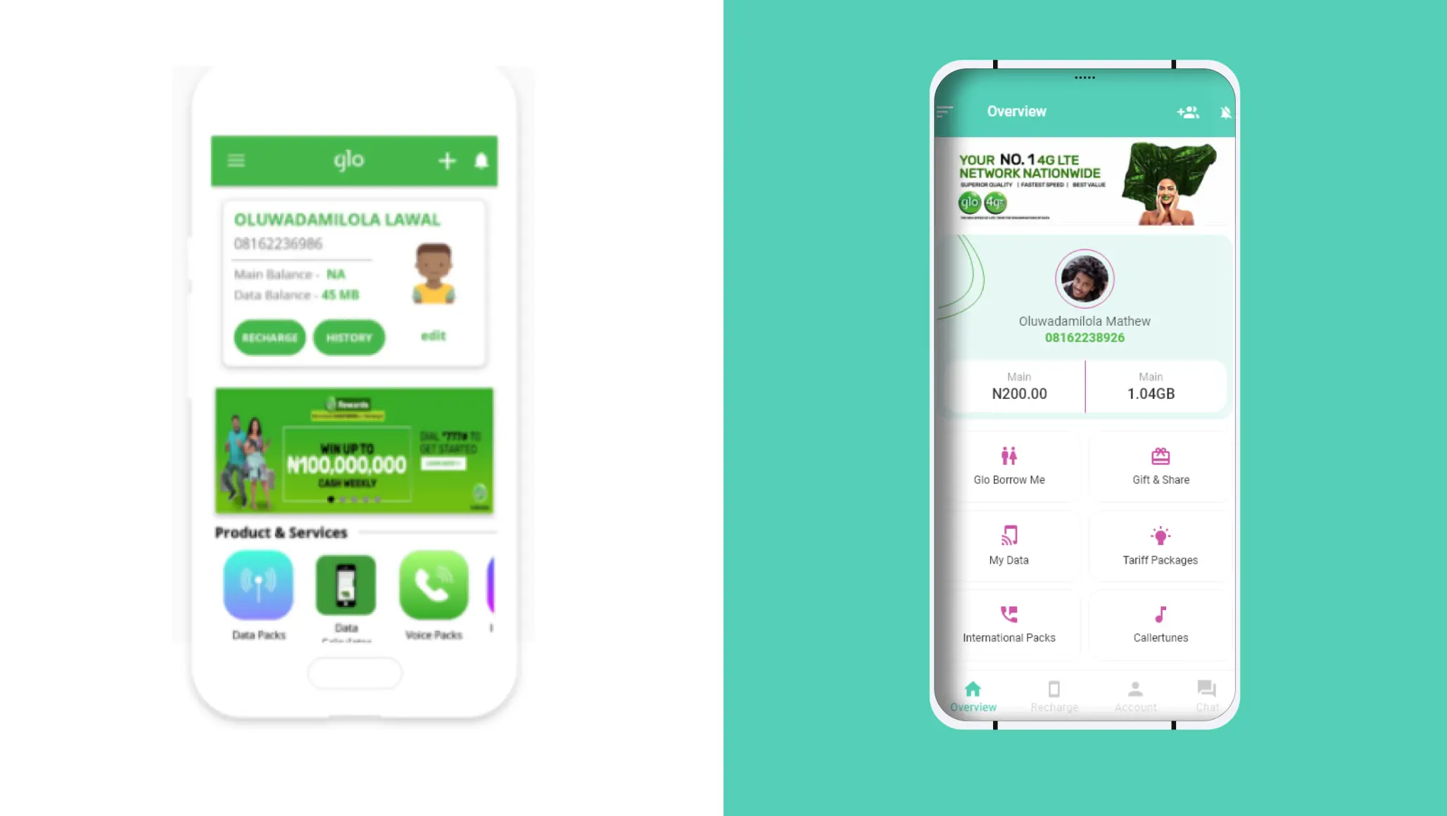
The home screen required some changes based on earlier research. Users expressed a desire for additional basic information and features that were not previously available. The new design includes details for xtratime and data bonus balances, as well as additional features to encourage user action.
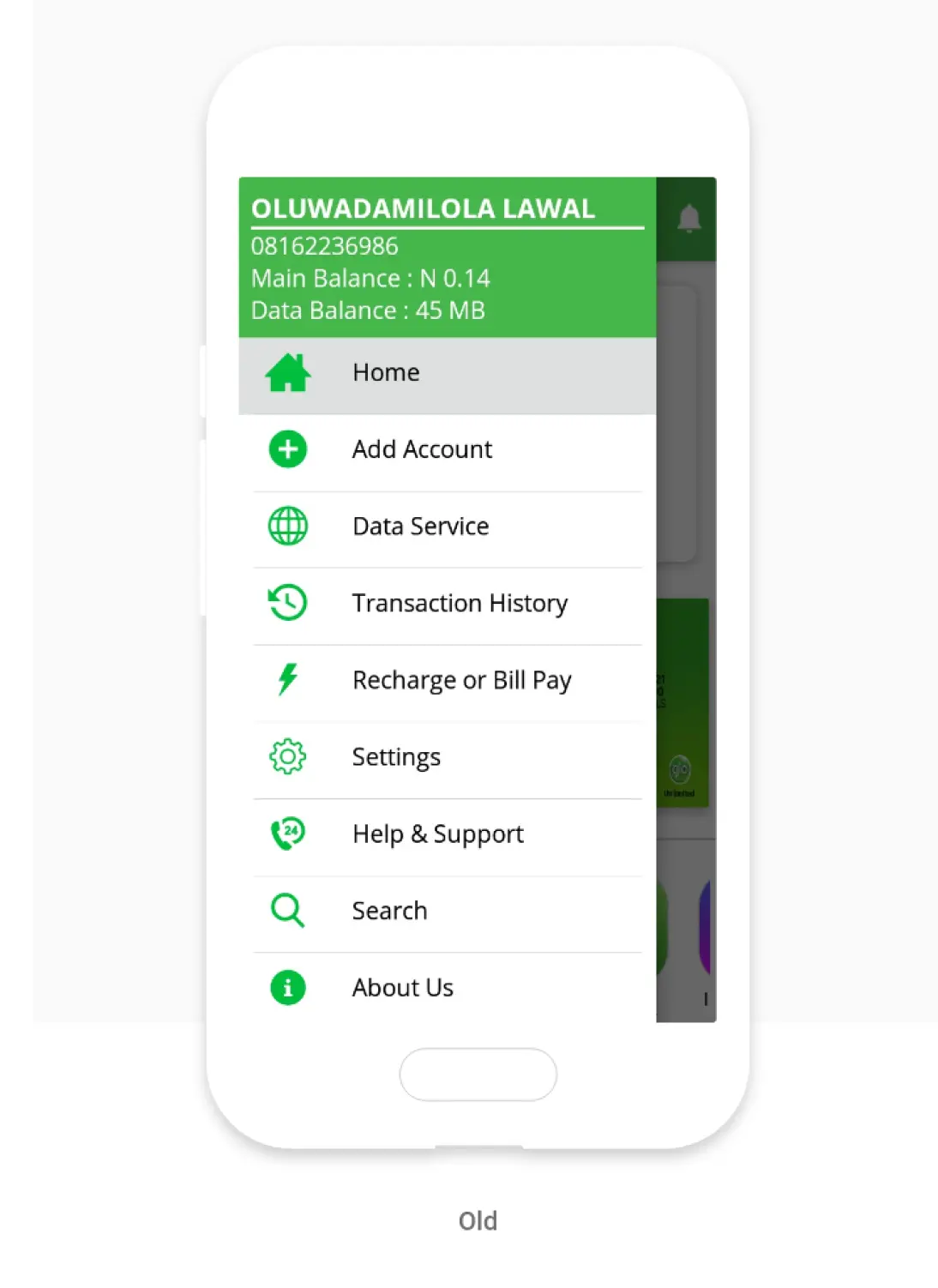
*Existing Glo Cafe AppRedesigned Glo Cafe App
Navigation System
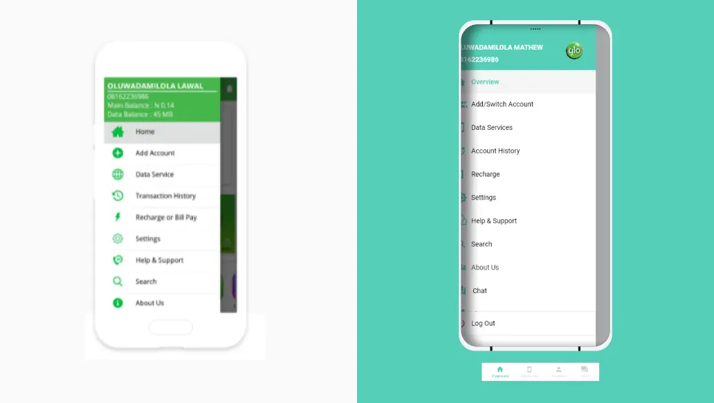
The home screen required some changes based on earlier research. Users expressed a desire for additional basic information and features that were not previously available. The new design includes details for xtratime and data bonus balances, as well as additional features to encourage user action.
*Existing Glo Cafe AppRedesigned Glo Cafe App
Chat Window
One of the major issues was not being able to access the chat window and ongoing chats once you leave the window. In a bid to solve this, I included the chat feature in the bottom navigation menu so it could be easily accessible and give users control and freedom to do other things. Also, some usability issues earlier identified were taken into consideration.
*Existing Glo Cafe AppRedesigned Glo Cafe App
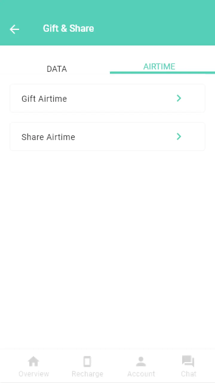
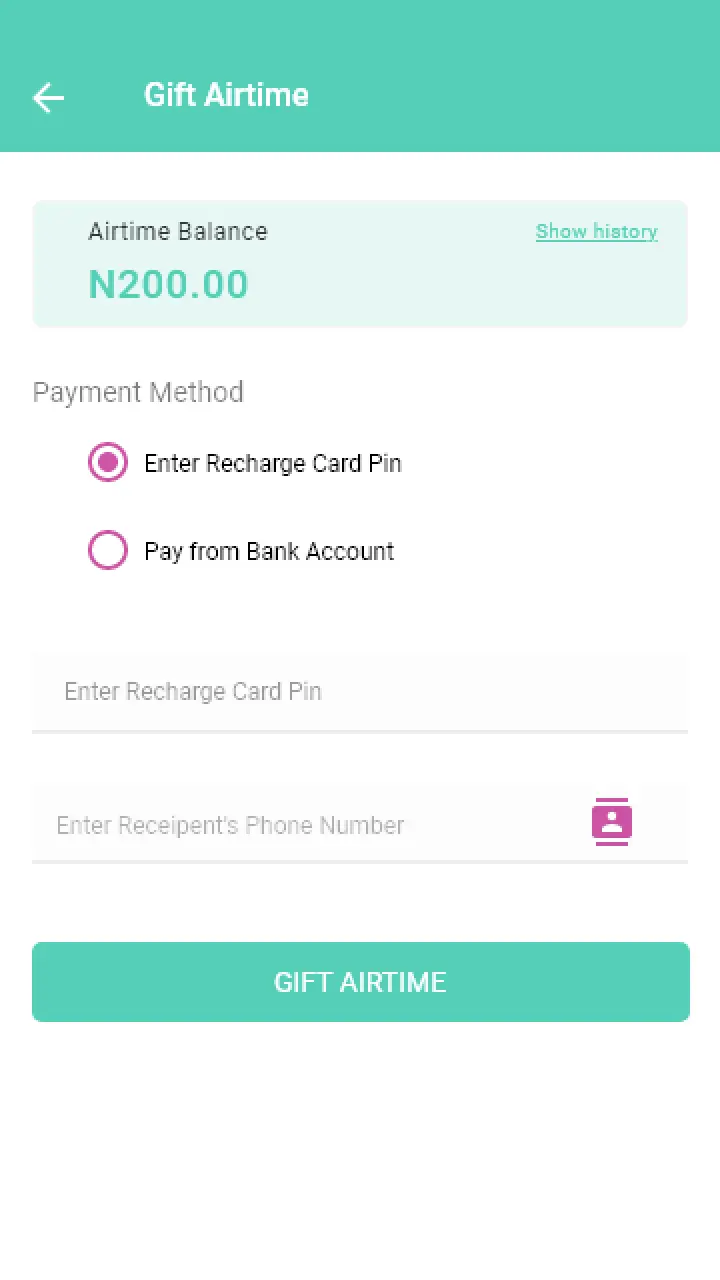
Gifting & Sharing Airtime
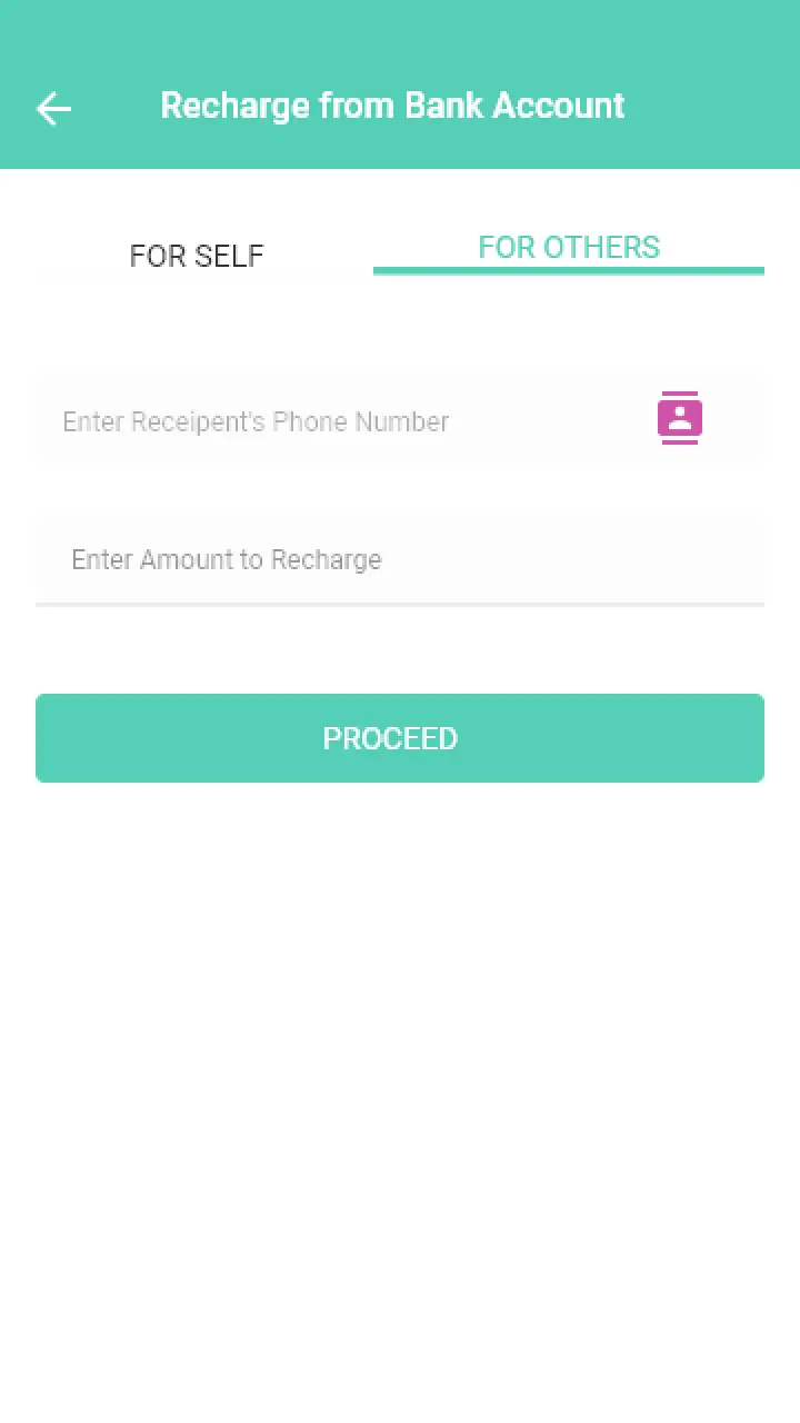
This is a feature that is non-existent on the current app. From the earlier research, users saw this as a basic necessity and this informed my decision to include the feature. Drawing inspiration from other competitors, I tried to make the experience seamless and quite straightforward.
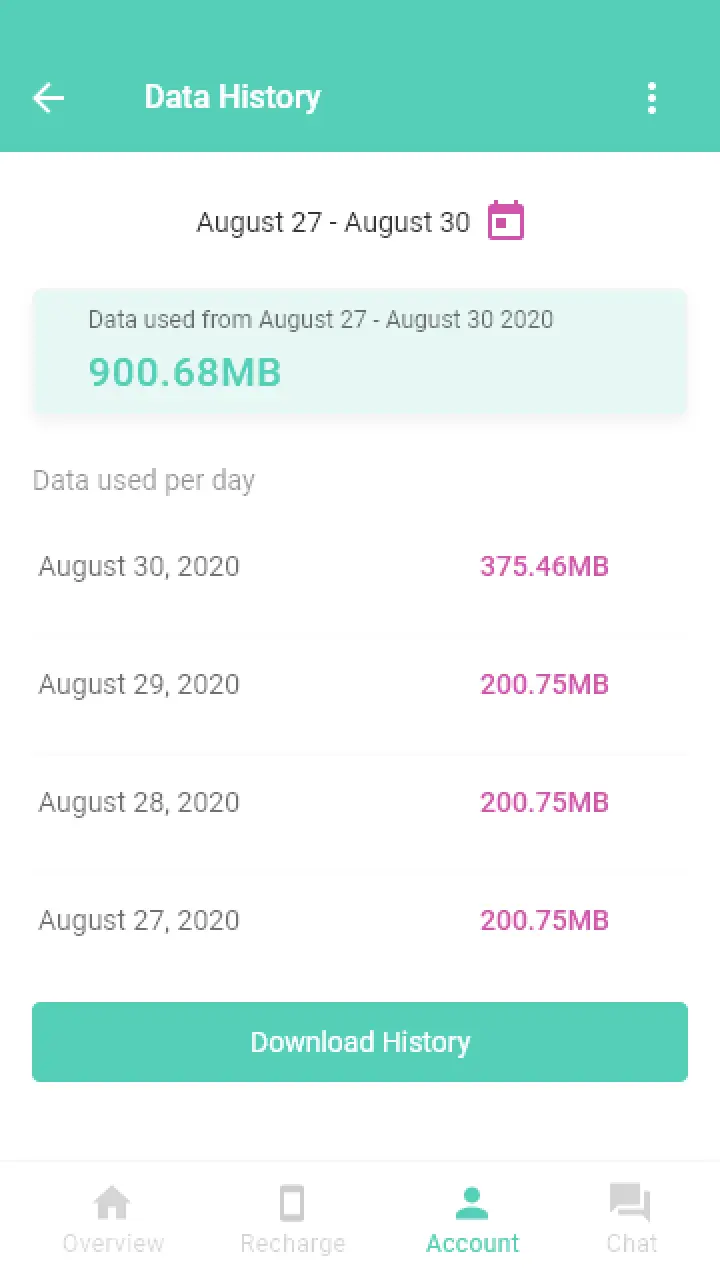
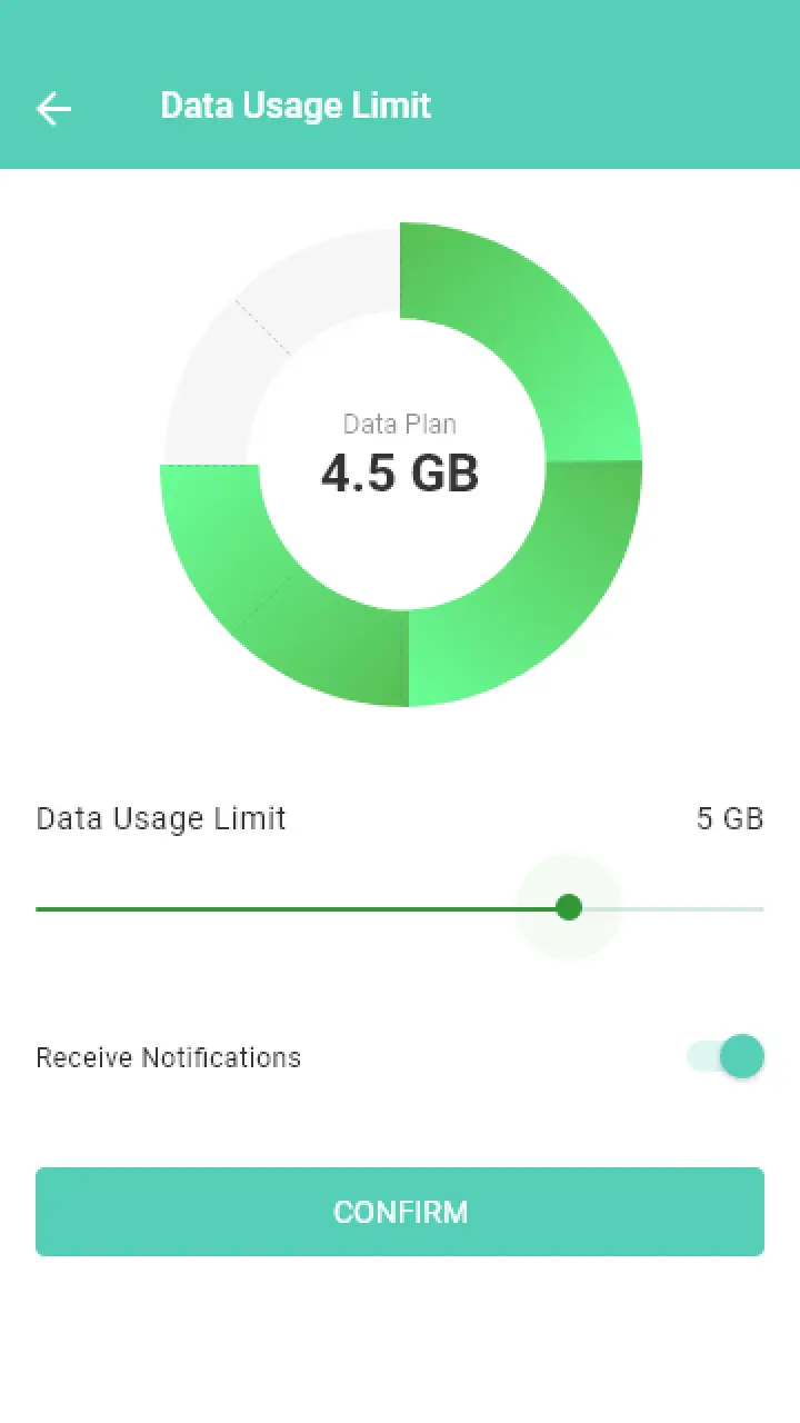
Monitoring Data Usage
Data usage history - it shows the amount of data that was used within a period of time and its breakdown on a daily basis.
Data usage limit - The user has the control to set a limit to her data usage and receive notifications when the limit is reached.
Data usage statistics - The user could see the breakdown of the data usage.
Recharge Account
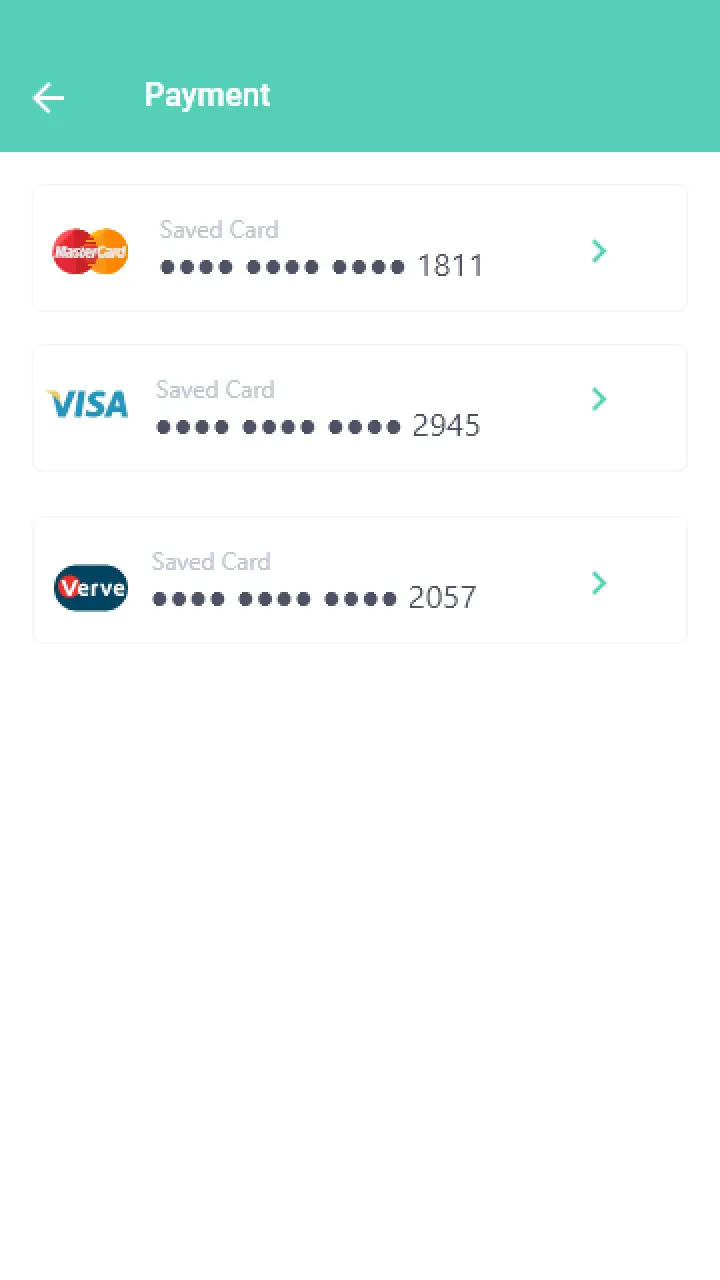
Another major pain point was users couldn't top-up their account using a recharge card pin directly on the app as compared to other network providers. I designed a simple interface to allow users perform this action.
Usability Testing
I conducted usability testing on the interactive prototype to see how users will complete a task once they were given some context. The primary goal is to see how easily they can perform these tasks and to confirm if they can recommend the app to a friend.
• I tested with 5 users and the tasks I tested for are:
• Recharge your Globacom account with the airtime top-up feature
• Chat with a Glo customer care representative
• Share and gift airtime to another subscriber
• View your account information
• Monitor Data Usage
Feedback
I had positive feedbacks as users find the app quite intuitive and speaks to their needs. It is a good improvement of the current app.
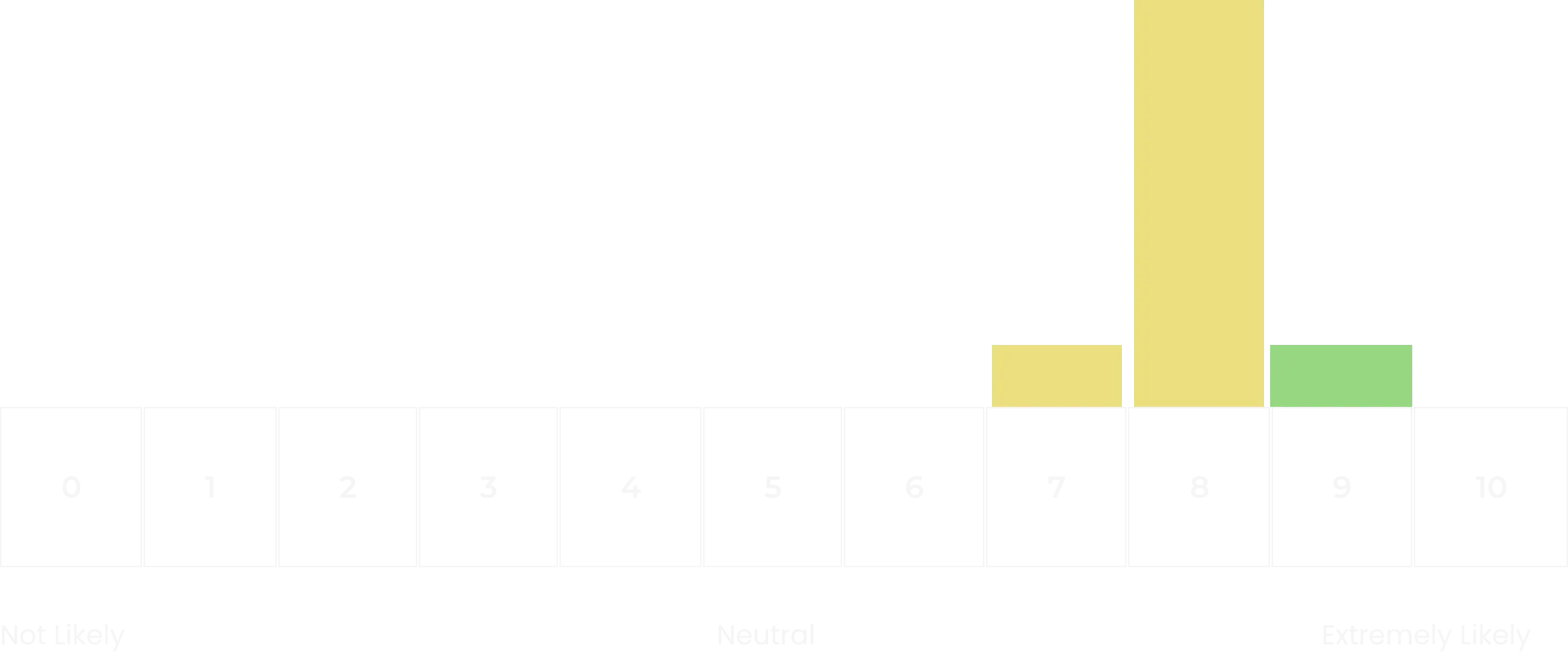
I asked each participant ' how likely they are to recommend this app to a friend on a scale of 0-10'. Below are their responses
NPS = +20
The positive Net Promoter Score indicates a good perception of the app and users are likely to recommend.

Task Success Rate

100%
1. Recharge your Globacom account with the airtime top-up feature

100%
2. Chat with a Glo customer care representative

100%
3. Monitor Data Usage

80%
4. Share and gift airtime to another subscriber

100%
5. View your account information
Reflections
No real time data to back up this feature. It hasn’t make sense to grant all users wishes and to focus more what users need

